> For the complete documentation index, see [llms.txt](https://developer.harness.io/llms.txt). Markdown versions of documentation pages are available by appending `.md` to page URLs; this page is available as [Markdown](https://developer.harness.io/cloud-cost-management/cost-reporting/bi-dashboards/overview/kubernetes-overview.md).
# Kubernetes
{% @harness-package-selector/package-selector platforms="%5B%7B%22label%22%3A%22Kubernetes%22%2C%22slug%22%3A%22kubernetes%22%2C%22path%22%3A%22cloud-cost-management%2Fcost-reporting%2Fbi-dashboards%2Foverview%2Fkubernetes-overview%22%7D%2C%7B%22label%22%3A%22AWS%22%2C%22slug%22%3A%22aws%22%2C%22path%22%3A%22cloud-cost-management%2Fcost-reporting%2Fbi-dashboards%2Foverview%2Faws-overview%22%7D%2C%7B%22label%22%3A%22GCP%22%2C%22slug%22%3A%22gcp%22%2C%22path%22%3A%22cloud-cost-management%2Fcost-reporting%2Fbi-dashboards%2Foverview%2Fgcp-overview%22%7D%2C%7B%22label%22%3A%22Azure%22%2C%22slug%22%3A%22azure%22%2C%22path%22%3A%22cloud-cost-management%2Fcost-reporting%2Fbi-dashboards%2Foverview%2Fazure-overview%22%7D%5D" selectedPlatform="kubernetes" %}
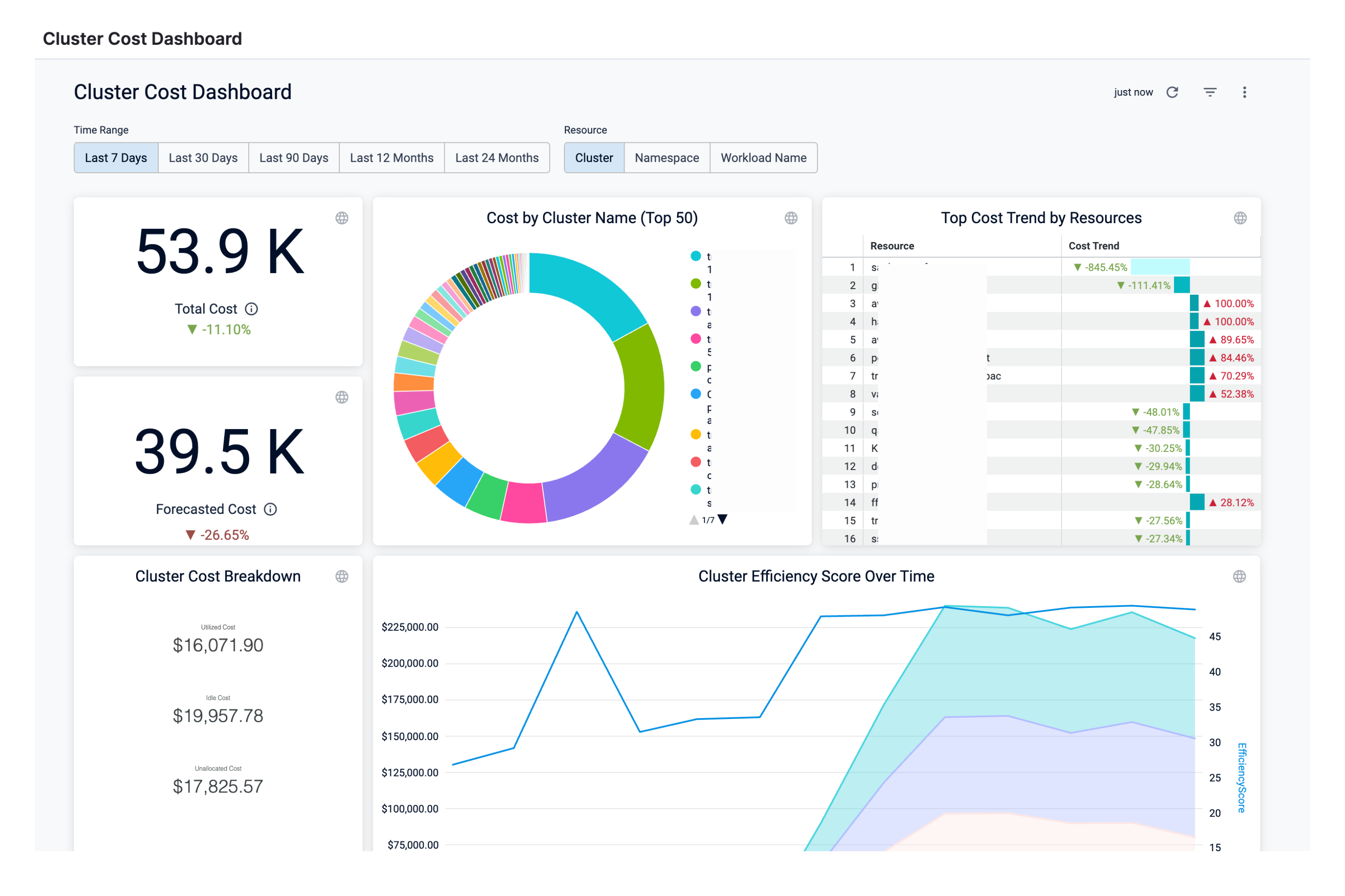
### View Cluster Cost Dashboard
Click to view full size image
Perform the following steps to view Cluster Cost Dashboard:
1. In the Harness application, click **Dashboards**.
2. Select **By Harness** and then, click **Cluster Cost Dashboard**.
The Cluster Cost Dashboard is displayed.
| **Dimensions** | **Description** |
| ---------------------------------- | ------------------------------------------------------------------------------------------------------------------------------------------------------------------------------------------------------------------------------------------------------------------------------------------------------------------------------------------------ |
| Total Cost | The total cloud cost across clusters with cost trend. |
| Forecasted Cost | The forecasted cluster cost with cost trend. Forecasted cost is the prediction based on your historical cost data and it is predicted for the same future time period as your selected time range. |
| Cost by Cluster Name (Top 50) | The cost of top 50 Kubernetes clusters. |
| Top Cost Trend by Resources | Top cost trend by resources. The cost trend is calculated based on the previous spending. |
| Cluster Cost Breakdown |
The utilized, idle, and unallocated cost details.
Utilized cost is the cost estimate for the utilized node or pod resources.
Idle cost is the cost of idle resources (CPU and memory) allocated to a Kubernetes pod.
Unallocated cost is the cost of unallocated node resources in a Kubernetes cluster.
|
| Efficiency Score | A measure of how cost-optimized your resource usage is across your clusters. It is derived from the total and idle (and or unallocated) spend of your resources. |
| Cluster Efficiency Score Over Time | A measure of how cost-optimized your resource usage is across your clusters over time. |
| Historical Cost vs Forecast | The historical and forecasted cluster cost. Forecasted cost is the prediction based on your historical cost data and it is predicted for the same future time period as your selected time range. |
| Current Period vs Last Period | The cost of the current and previous time range. |
| Most Expensive Clusters | The cost of the most expensive Kubernetes clusters. A cluster refers to a collection of nodes that run workloads as containers in any cloud provider. |
| Most Expensive Namespaces | The cost of the most expensive Kubernetes namespaces in the cluster. |
| Most Expensive Workloads | The cost of the most expensive Kubernetes workloads in the cluster. |
| Most Expensive Nodes | The cost of the most expensive Kubernetes nodes in the cluster. |
1. Select **Time Range** to filter the data based on pre-defined time range filters. The available filters are:
* Last 7 Days
* Last 30 Days
* Last 90 Days
* Last 12 months
* last 24 months
2. Select **Resource** to filter the data based on pre-defined resource filters. The available filters are:
* Cluster
* Namespace
* Workload Name
3. Once you have selected the **Time Range** and **Resource** filter, click **Reload**. The data is refreshed with the latest data from the database. By default, the **Last 30 Days** and **Cluster** are selected.
4. Hover over the chart to see the cost details.
5. In **Cost by Cluster Name (Top 50)**, click the up or down arrow button to scroll up or down the list. The list shows the percentage of each account with respect to the cost contribution.
6. In **Cost by Cluster Name (Top 50)**, click on the chart to further drill into the cost details of Product, Region, or SKU. You can drill down by:
* by Namespace
* by Workload Name
7. The dashboard displays the cost data based on the selection in the previous step.
8. You can further drill down and view the cloud cost of a specific **Namespace**. For example, drill into harness-nextgen and view the cost **by Workload Name**.
The details in the Dashboard are displayed. You can also view the details of the filters applied.
9. Click **Back** to go back to the previous page in the Dashboard.
10. Click **Download** to download the Dashboard.
11. You can also drill into **Cluster Efficiency Score Over Time**, **Most Expensive Clusters**, **Most Expensive Workloads**, and **Most Expensive Namespaces** and view details in the Dashboard.
12. Click the **Filter** icon to hide or show the filters.
{% @harness-feedback/feedback %}