Interpret Metric Verification Results
Metrics serve as measurements taken at specific points in time for a system. They include a value, a timestamp, and an identifier indicating what the measurement applies to, such as a source or a tag. Unlike logs, which can be collected whenever an event occurs, metrics are usually collected at regular intervals.
The data collected in a time-series metric forms a collection of measurements over time. The visual representation of metrics, such as graphs, help in understanding the trends and patterns in the system's performance and behavior.
In simpler terms, metrics provide a snapshot of the system's state at a particular moment, including information about what is being measured, when it was measured, and the value recorded. This data is collected periodically and can be presented in different visual formats for easier analysis and monitoring.
Metric analysis helps automatically identify variations in metrics after deployment before they become widespread issues.
Application Performance Monitoring (APM) tools such as AppDynamics and Dynatrace help you monitor and analyze the performance of web applications in real-time. To see the list of APM tools supported by Harness, go to What's supported in CV.
Metric verification in Harness CV
You can configure your APM tool (also known as a health source) in Harness CV. Harness CV uses the data provided from your APM tool to analyze variations in different metrics. Harness uses the Machine Learning (ML) model to predict your service's behavior and applies anomaly-detection techniques to the modeled representation to predict regressions in behavior or performance.
View metric verification results
Harness CV provides a powerful mechanism to visualize and interpret the metric verification results.
Prerequisite: You should have added a health source to the AI Verify (v1) step and run the pipeline. To learn more about how to add a health source to the AI Verify (v1) step and run the pipeline, go to Configure CV.
To view metric verification results for a pipeline:
-
In your Harness project, navigate to the Deployments module > Pipelines, and then select a pipeline for which you want to view the verification results.
-
In the top right corner, select Execution History, and from the pipeline executions list, choose the execution for which you want to see the verification results.
-
Ensure that the Console View toggle switch is turned ON.
-
From the stages list, expand the stage in which you want to see the verification results, and then select Verify Verification details appear on the right.
-
Go to the Metrics tab to see the metric verification details.
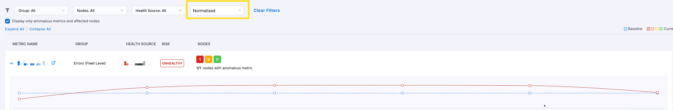
The Metrics tab has the following sections:
- Nodes section
- Metric summary
The following screenshot shows the metric verification results for an Appdynamics health source.

Nodes section
This section provides a graphical representation of nodes detected during CV based on the deployment type. The nodes are represented as hexagons.
Canary deployments
Both the Primary and Canary nodes are displayed. Canary nodes are only visible after the deployment, while primary nodes are seen "Before" and "After" the deployment.

Rolling or Blue Green deployments Both the "Before" and "After" nodes are displayed as the analysis involves comparing metric data before and after the deployment. The "Before" nodes are those observed before the deployment, and the "After nodes are those seen after the deployment.

Verification status indicator
The color coding of hexagons provides a visual representation of the verification status, enabling quick identification of any metric failures.
A red-colored hexagon indicates that at least one metric has failed verification. Conversely, a green-colored hexagon indicates that all the metrics have successfully passed the verification process.
-
Harness identifies nodes based on the user-configured Service Instance Identifier field in the health source configuration. It is crucial to ensure the correct configuration of this field to avoid mismatched node names in the display that may not correspond to the actual running nodes.
-
When using Dynatrace as the health source, only one node will be visible since Dynatrace does not support node-based metrics.
Metrics summary section
The metric summary provides an overview of the verification results, indicating the risk level associated with each metric and summarizing the risk across nodes.
-
Risk: Each metric is assigned one of three risk levels: Healthy (indicated in green color), Observe (indicated in orange color), or Unhealthy (indicated in red color). The risk is determined by considering two factors: the deviation in metric data for a specific node and the sensitivity configuration of the verification step. When aggregating the risk across all nodes, the highest risk level among them is considered the overall risk for the metric.
-
Nodes: This is a summary of the metric's risk across all available nodes, including "Canary" or "After" nodes. It displays the risk level using color-coded indicators that represent the three risk categories: Healthy (indicated in green color), Observe (indicated in orange color), and Unhealthy (indicated in red color). The node summary helps in understanding the overall risk associated with the metric across different nodes in the system.

The following error scenarios are considered in the risk calculation: If there is a metric for which data is available for a specific Canary/After node but not for any of the Primary/Before nodes, the risk is marked as "No Analysis" for that particular Canary/After node. If there is a metric for which data is not available for a specific Canary/After node but is available for any of the Primary/Before nodes, the risk is marked as "No Data" for that particular Canary/After node.
Any metric marked as "Throughput" is not analyzed during the verification process. Throughput metrics is used for validating other metrics like error metrics. Choose "Other" metric type if you want to analyse your metrics.
Filter metric summary
You can customize the metrics summary view using the following filters:

-
Group: When configuring the health source, you have the flexibility to group a set of metrics together, such as a transaction group. Using the Group filter, you can filter the results based on these predefined metric groups. For health sources such as Appdynamics, New Relic, and Dynatrace, metrics are automatically grouped based on transactions, making all transactions available in the dropdown filter.
-
Nodes: Using this filter, you can narrow down the results by selecting a specific "Canary" or "After" node, depending on the type of deployment.
-
Health Source: If multiple metric health sources are used in the verification process, you can use this filter to view the results specific to a particular health source.
-
Raw and Normalized: Use the Normalized filter option to view the metric data in a standardized form used by ML analysis. The system performs a normalization process for ML analysis by converting three adjacent minutes of metric data into a single data point (an average of the adjacent minutes' data). Use the Raw filter option to see the metric data exactly as provided by the source, without any modifications.
Metric details graph
The metric details graph provides a comprehensive view of the actual metric data, including comparative analysis, metric thresholds, and the reasons for any failures.
Expand a metric to view the Metric Details Graph.
In metric graphs, the "Canary" or "After" nodes are referred to as "Test Hosts", while the "Primary" or "Before" nodes are called "Control Hosts".
In the example below, if there are two Canary nodes named "test-host-1" and "test-host-2," the metric graph will display the comparison of each Canary node with the corresponding Primary node that has the minimum deviation. In the provided example, the graph shows the metric data for "test-host-1" compared to "control-host-1" and for "test-host-2" compared to "control-host-2."

Below each graph, the results are displayed, indicating whether the metric comparison failed due to ML analysis or the metric threshold. In the given example, both nodes failed due to ML analysis. The failure occurred because of a deviation in the metric values, although the fail-fast threshold was not breached.
The Details section also shows all the thresholds defined for that metric. If the comparison failed due to a metric threshold, the corresponding threshold configuration will be indicated in the user interface.
For instance, in the example below, the reason for the failure is mentioned as "failed because a fail-fast threshold was breached." Observe the threshold configuration under the details section, marked as "applied." It's important to note that if a fail-fast threshold is applied, no normalized data will be displayed. This is because, in such cases, ML analysis is not involved, and therefore, normalization of the metric data is unnecessary.

View specific metric values
In the metric details graph, hover over the graph to view the specific metric values for a particular point.
For canary deployments, the timestamp displayed for both test and control data remains the same. However, in other types of deployments, the timestamp for the test data represents the post-deployment period, while the timestamp for the control data corresponds to the pre-deployment period.