Manage Catalog UI
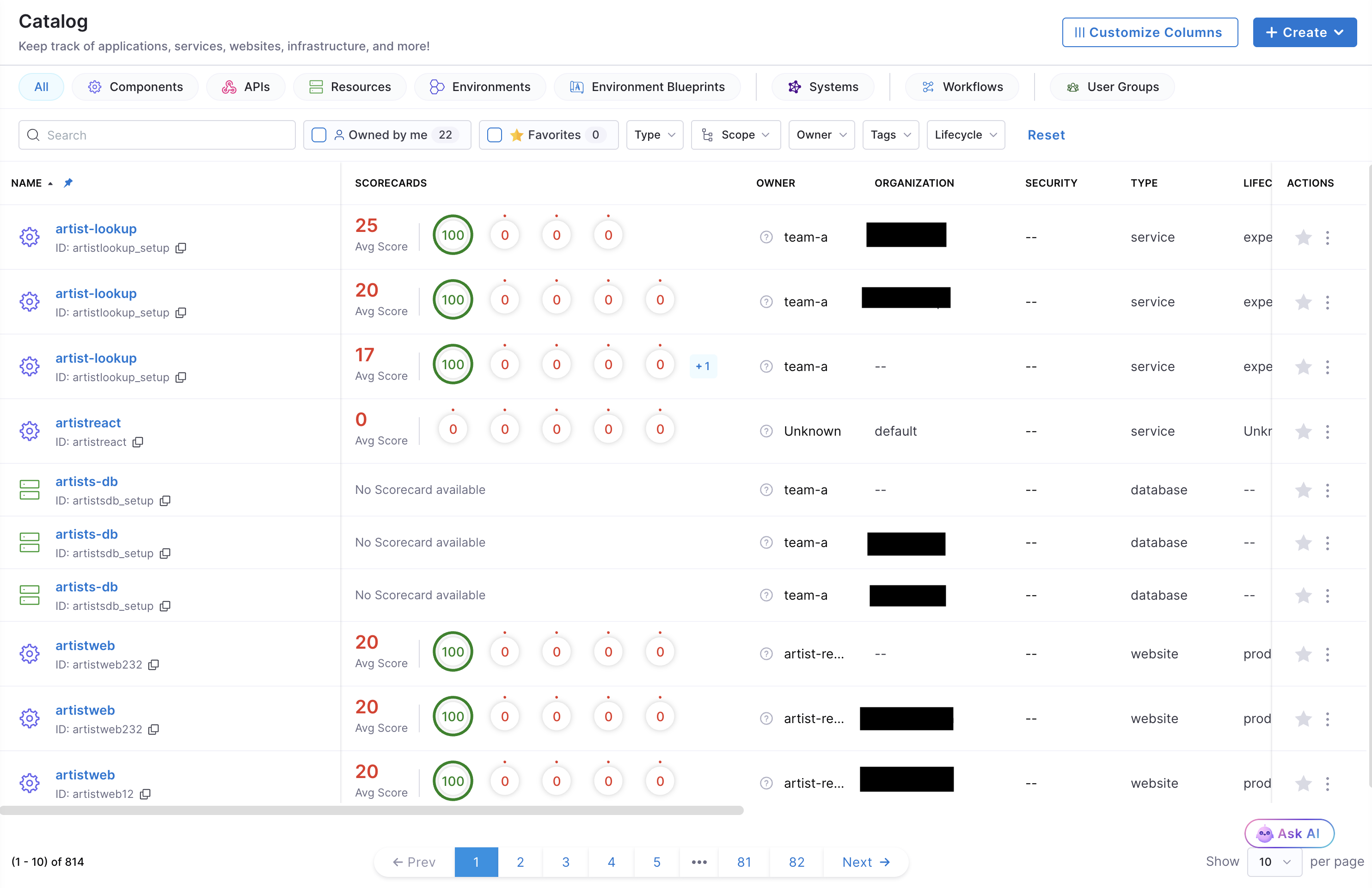
The Catalog table is an all-in-one view and centralized registry of all your software entities (services, websites, APIs, libraries, etc.). It’s where you can view, manage, and search for software entities and track their ownership, dependencies, and metadata.
This guide details the steps to customize and manage custom columns in a Catalog table.
Customize Catalog Table UI
This feature enables you to customize and manage the columns of the Catalog table to meet your requirements. Your Catalog table can be tailored for your team to display the most relevant information for the specific entity kind you’re viewing.
Prerequisite
- Users with Create/Edit permissions on the Layout resource in Harness IDP, or users with the IDP Admin role, can customize the Catalog table UI. See Scopes, Roles & Permissions to learn more about configuring these permissions.
Customize Columns
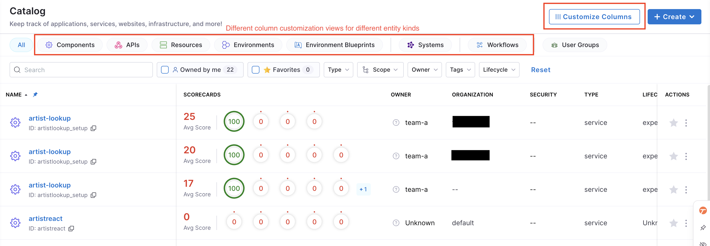
To customize the columns of the Catalog table, go to your Catalog view and click Customize Columns in the top-right corner. Each customization view in the Catalog table is tied to a specific entity kind. This means every entity kind has its own unique customization view, allowing different column configurations for different entity kinds.
Follow these steps to customize columns:
-
Select the entity kind you want to customize from the top filters.
-
Click Customize Columns.
-
Customize columns in the following ways:
- Reorder Columns: Drag and drop columns to reorder them. You can also reorder columns by opening Manage Columns (top-right of the table) and dragging the column name.
- Hide/Show Columns: Toggle the visibility of columns. Click any visible column in the table and select Hide. You can also control visibility in Manage Columns by checking/unchecking the column name.
- Pin Columns: Pin columns to the left side of the table to keep them visible while scrolling. Click the column and select Pin. You can pin up to three columns. You can also pin columns in Manage Columns by clicking the pin icon next to the column name.
- Resize Columns: Adjust column widths by dragging the divider on the column header.
-
Click Save Changes to save the customization view.
Ensure to edit and save the customization view for each entity kind you want to modify. Changes apply only to the entity kind that’s currently selected.
Add Custom Columns
You can define custom columns in the Catalog table using entity metadata. This feature lets you add columns based on custom Catalog properties.
Follow these steps to add custom columns to your Catalog table:
-
Select the entity kind you want to customize from the top filters.
-
Click Customize Columns → Manage Columns.
-
Scroll down and click Create new column at the bottom of the card.
-
Provide the following details:
-
Catalog Custom Property: Enter the custom property to display in the column, for example,
spec.lifecycleormetadata.description. -
Column Name: Enter the name that will appear in the table.
-
Data Type: Select the data type of the custom property. Supported types:
StringNumberURL
-
Column Description (optional): Enter a description for the column.
-
-
Select the checkbox at the bottom if you want the column to be shown in the table.
-
Click Save Changes to save the custom column.
You can also edit or delete custom columns in the same Manage Columns view. Click the Edit or Delete icons next to the custom column name to modify it.
Understand Catalog Entity UI
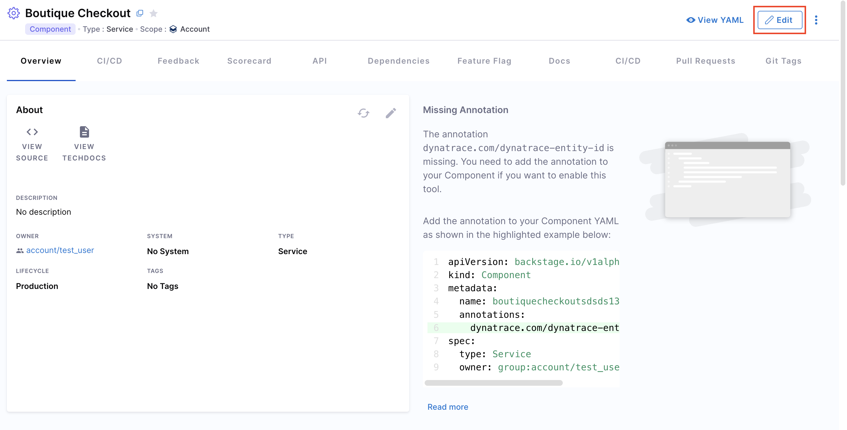
Whenever you register an entity in your software catalog, you can view all its details from the Catalog Entity page in your Harness IDP UI. Every section on the entity page is uniquely designed to present the most relevant information for the specific type of entity you're viewing.
Here’s how to access the catalog entity details page:
- In your Harness IDP, navigate to Catalog.
- Select the entity you want to view. You’ll be redirected to the entity details page.
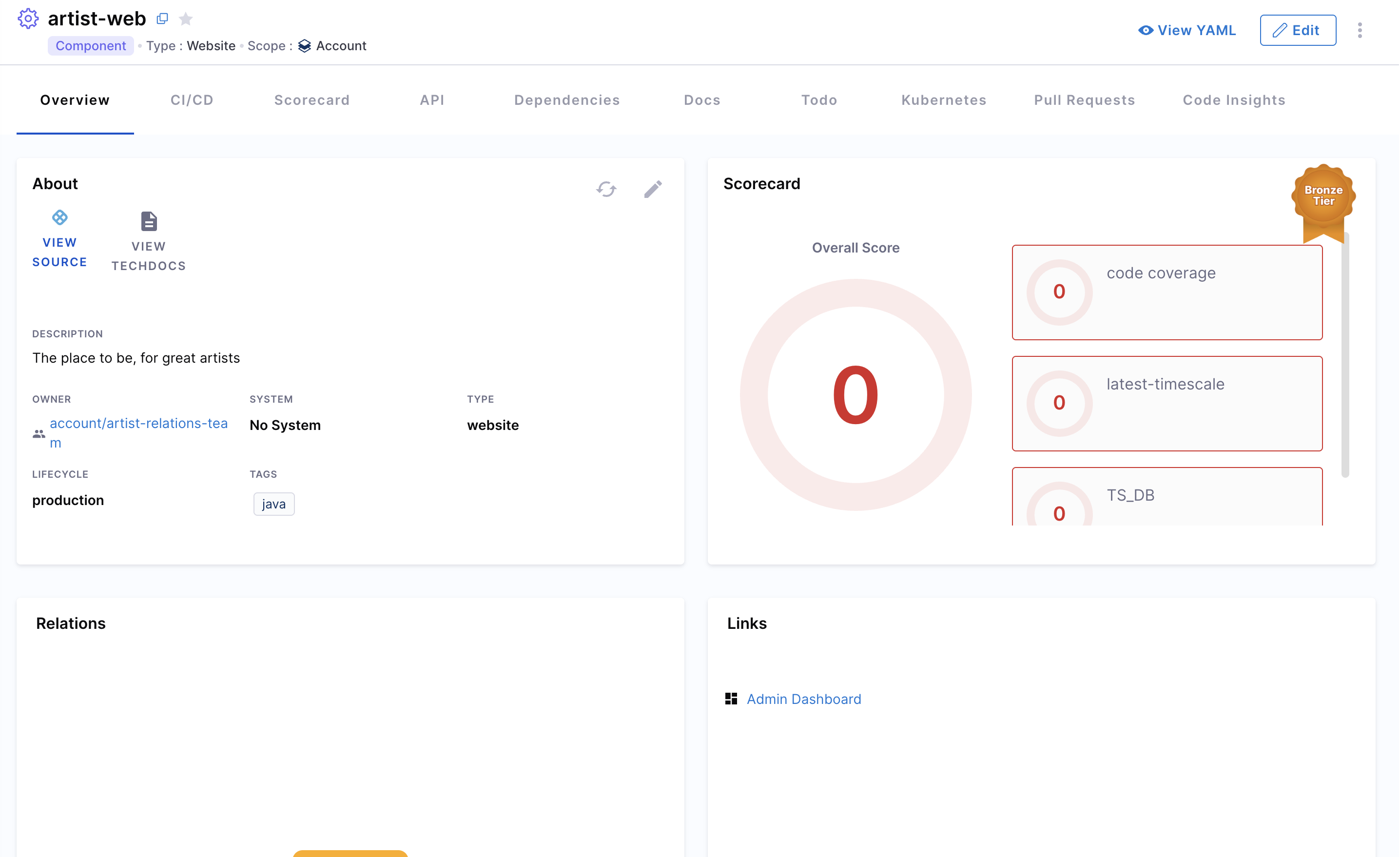
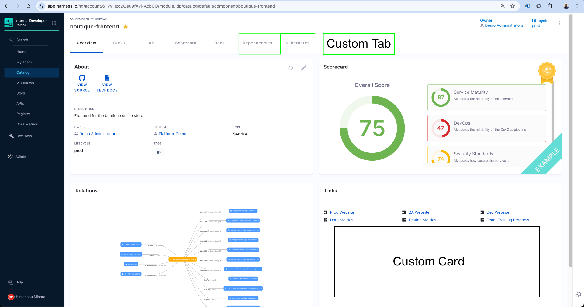
The Catalog Entity Details Page is divided into multiple tabs, each showing different components, cards, and views relevant to that entity.
- Each tab represents a specific section.
- You can customize and edit tabs by modifying the entity layout.
- All views inside a tab are powered by out-of-the-box components like the "About Card," "Scorecard Card," and the Plugins configured for your instance.
When you enable a plugin (or create a custom one), you can choose where the plugin’s components appear by modifying the Layout YAML of the catalog entity.
- When a plugin is enabled, the default layouts are auto-updated.
- You can always make changes manually by checking the exported UI components from that plugin (documented under each plugin's section).
Manage Catalog Entity UI
You can manage and edit Catalog Entity UI layouts directly using the Layout Editor.
- Each Catalog Layout is uniquely designed for a specific
KindandTypeof application. - Learn more about
Kindsin the Catalog YAML documentation and understand the System Model for different use-cases.
For example:
- A typical microservice will have
kind: Componentandspec.type: service.
Note: Entity kinds (such as Component, API, Resource) are fixed. However, you can create any arbitrary types under them (e.g.,
spec.type: micro-frontend).
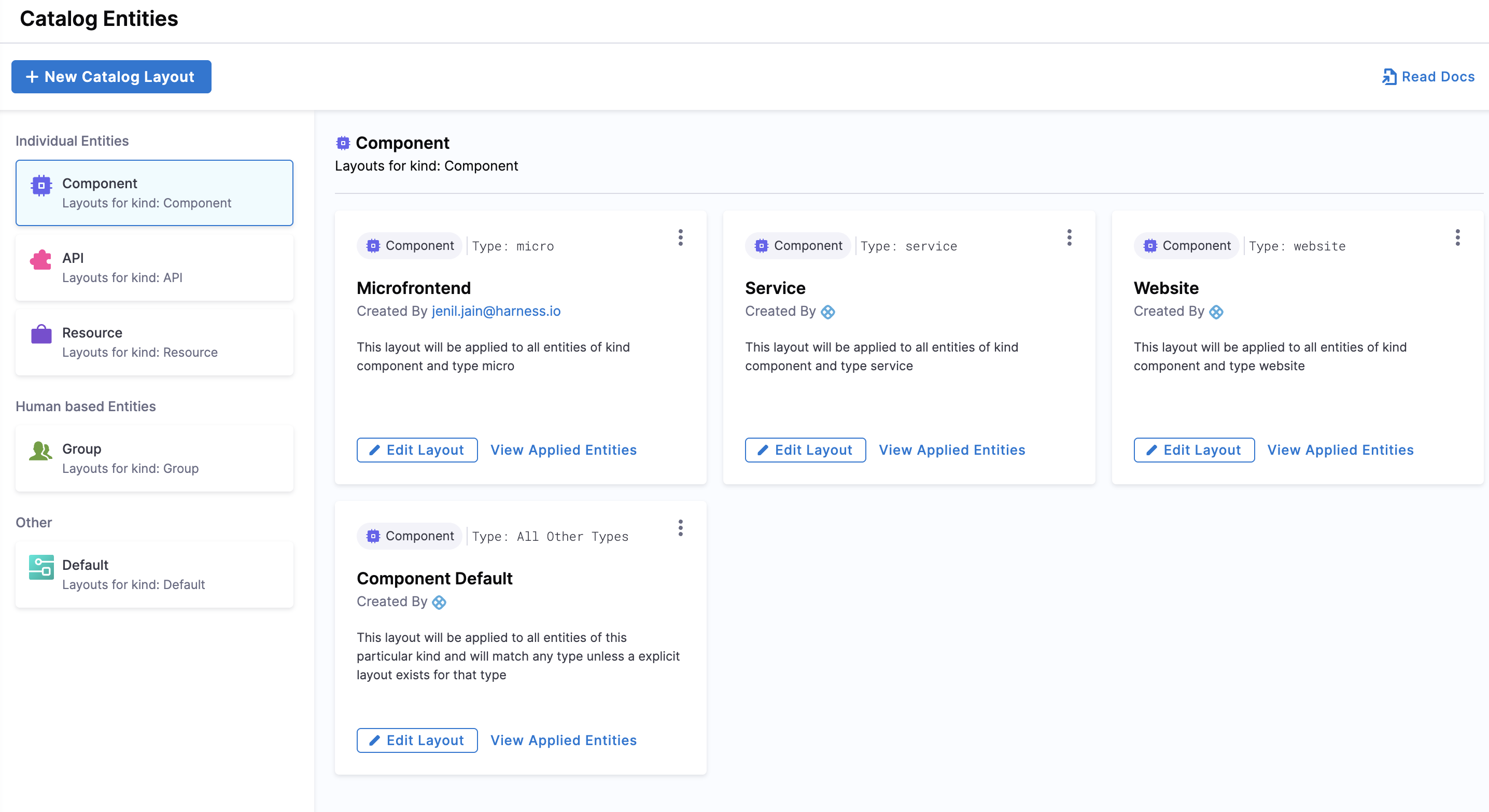
Use the Layout Editor
Access the Layout Editor
- Interactive guide
- Step-by-step
- In Harness IDP, go to Configure > Layout.
- Select Catalog Entities.
- Choose the Entity Kind you want to modify.
- Layouts are organized by:
Kind(e.g., Component)Type(e.g., service, website)- A default layout acts as a fallback if a specific type layout isn’t defined.
Create a New Layout
- Interactive guide
- Step-by-step
- Duplicate an existing layout or click New Catalog Layout.
- Select the Entity Kind and Entity Type this layout will apply to.
- Click Continue to create the new layout.
- Start editing the Layout YAML to configure it.
Edit an Existing Layout
- In the Layout Editor, select the relevant Entity Kind and Entity Type.
- Click Edit Layout and modify the YAML.
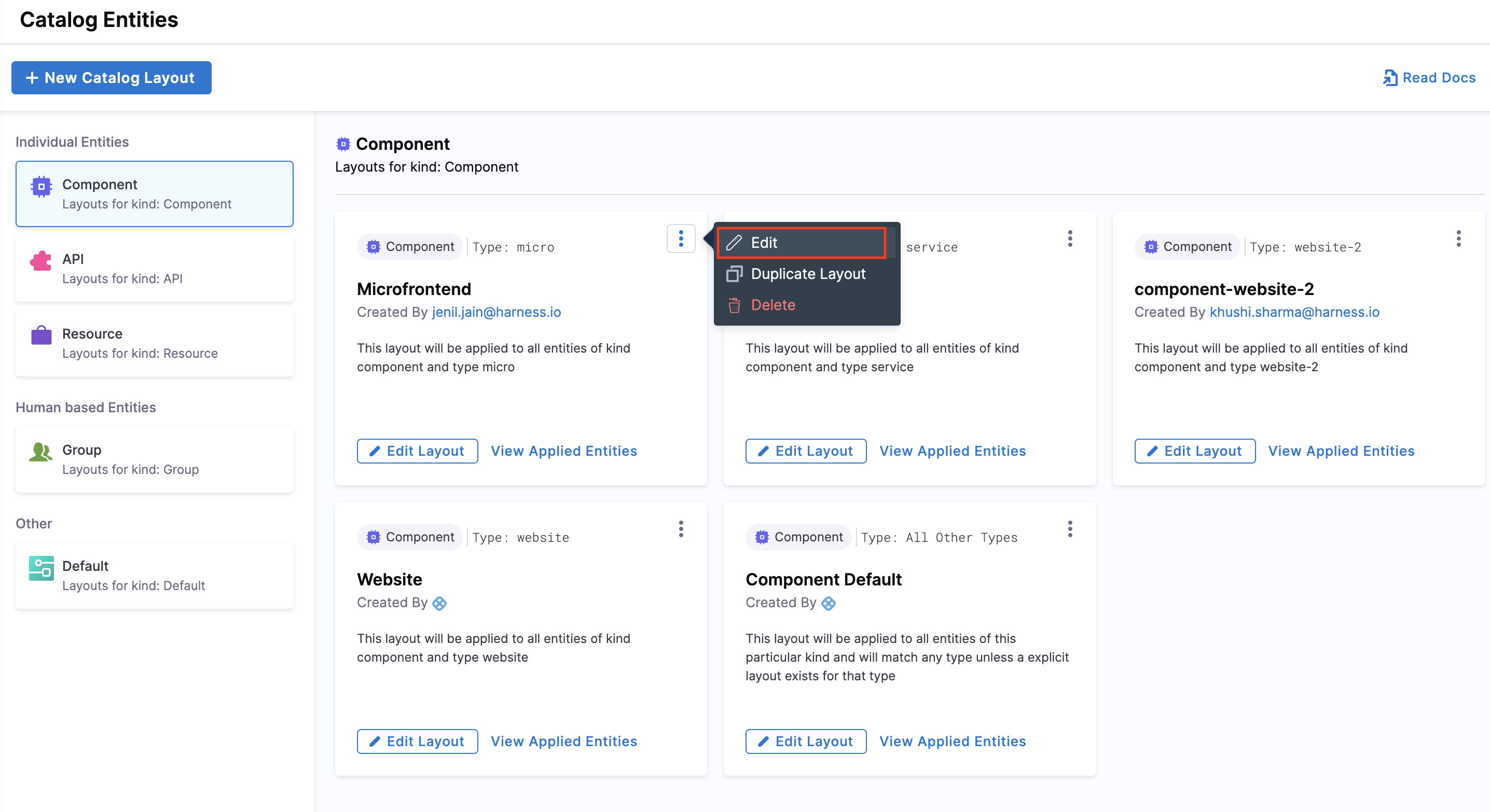
View Applied Entities:
You can see which entities a specific layout applies to by clicking View Applied Entities.
Understand Layout YAML
Entity Page Layouts are defined in a hierarchical structure, starting with the page key, which represents the entity page. Each page consists of tabs, an array that controls the rendered tabs for the entity page.
| Key | Description |
|---|---|
page | Represents the entity page configuration. |
tabs | Defines the tabs shown on the entity page. |
contents | Specifies components rendered inside each tab. |
component | Defines an individual component. |
specs | Contains additional configurations for the component. |
props | Properties for the component. |
gridProps | Grid settings for arranging components. |
cases | (Specific to EntitySwitch) Conditional rendering based on logic. |
Example: Entity Layout YAML
page:
  name: EntityLayout
  tabs:
    - name: Overview
      path: /
      title: Overview
      contents:
        - component: EntityOrphanWarning
        - component: EntityRelationWarning
        - component: EntityProcessingErrorsPanel
        - component: EntityAboutCard
          specs:
            props:
              variant: gridItem
            gridProps:
              md: 6
        ...
    - name: ci-cd
      path: /ci-cd
      title: CI/CD
      contents:
        ...
    - name: Deps
      path: /dependencies
      title: Dependencies
      contents:
        ...
    - name: TechDocs
      path: /docs
      title: Docs
      contents:
        ...
Advanced Use Cases
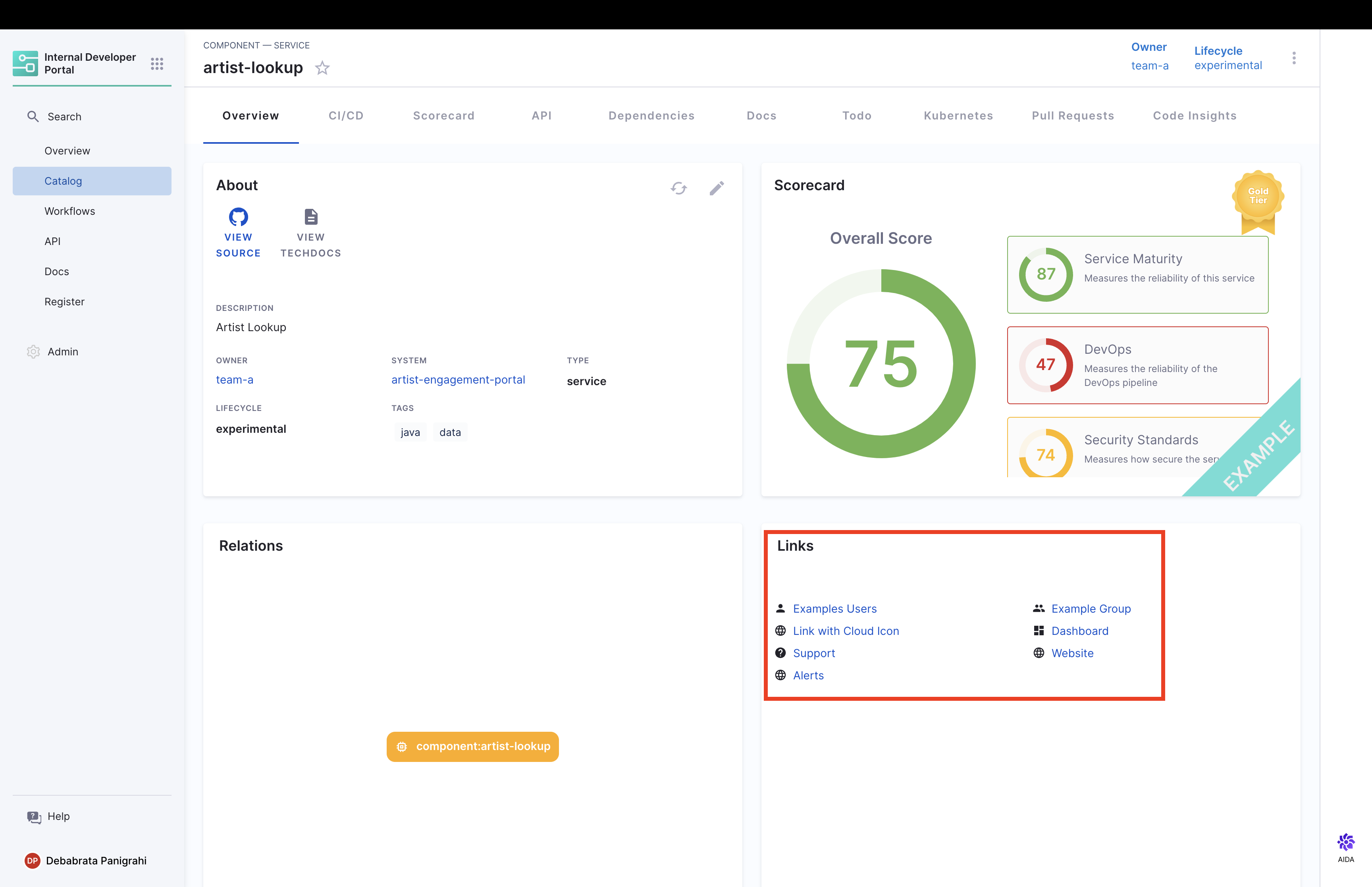
Add Links
You can also add a list of external hyperlinks related to the entity on the catalog entity's UI page. Links can provide additional contextual information that may exist outside of Harness itself, such as an admin dashboard or an external CMS page.
Here’s how "Links" show up in your Catalog entity details page. The Links Card serves as a navigational tool, and these links can point to anything. Here are some examples:
- User and Group Management
- Infrastructure and Cloud
- Operational Dashboards
- Support and Help
- General Web and Information
- Notifications and Alerts and more, serving as quick bookmarks for developers corresponding to the entity.
You can add links for an entity by using the metadata.links field in your Catalog YAML. Here is the list of fields required:
| Field | Type | Description |
|---|---|---|
url | String | Destination URL. |
title | String | Display name for the link. |
icon | String (Optional) | Icon name from SimpleIcons. |
Here’s how you can add links in your catalog entity page:
- Go to your Catalog, and select the entity you want to add links for.
- Click on the Edit button and switch to the YAML view to edit the YAML.
- Add a
linksreference in your entity YAML under themetadatafield. You can refer to the Example YAML for thelinksreference.
Example YAML:
metadata:
  name: artist-lookup
  links:
    - url: https://example.com/user
      title: Example User
      icon: user
    - title: Prometheus
      url: https://example.com/prometheus
      icon: prometheus
    ...
Add an Additional Info Card
You can add an Additional Info Card to display additional details about the catalog entity on the "Overview" page. You can populate this card using the catalog entity's YAML metadata for fields like apiVersion, kind, metadata, and spec, including additional values ingested.
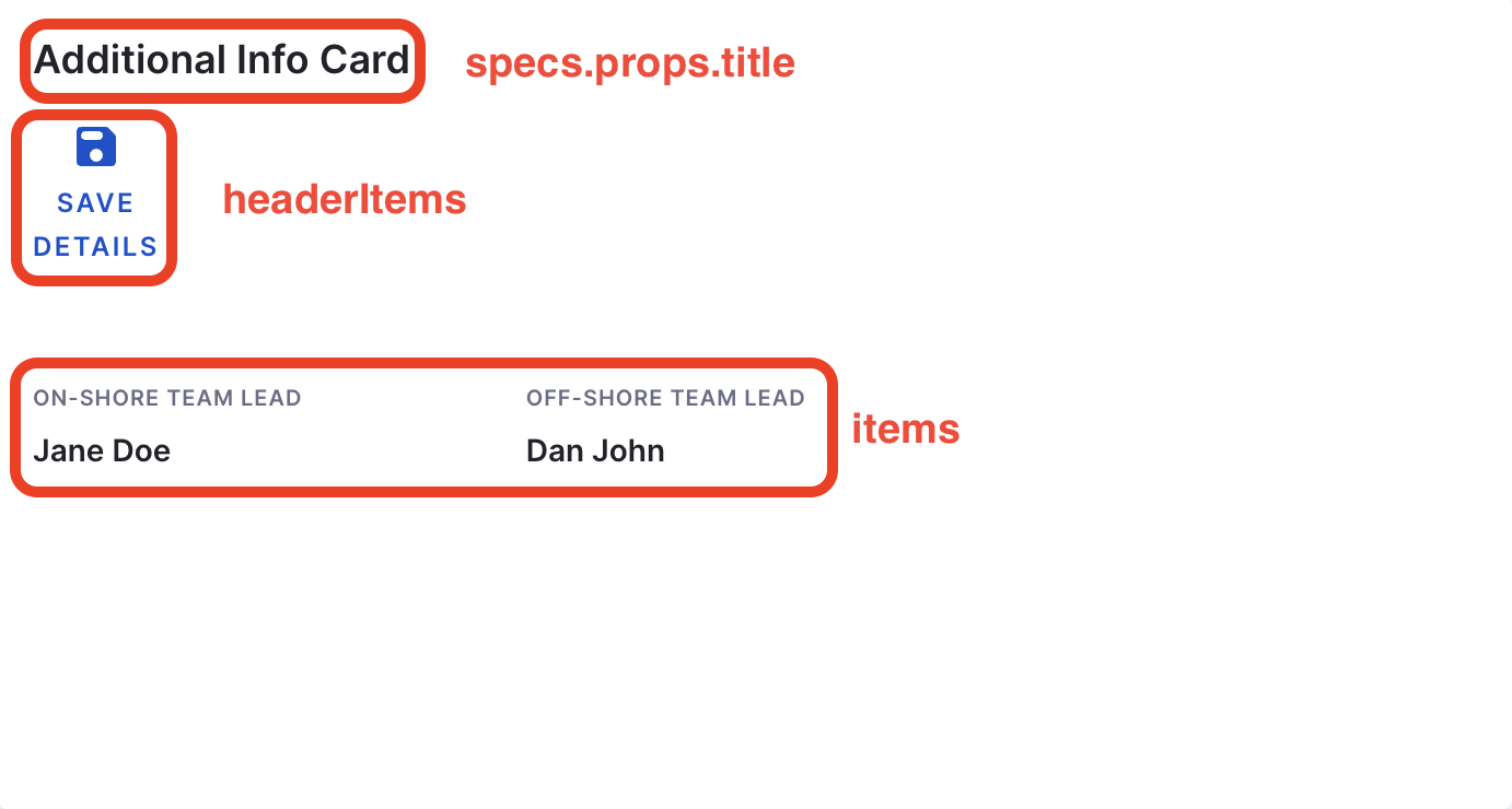
Additional info in metadata
To add custom information beyond the default root fields, use the additionalInfo key under metadata. This supports adding key-value pairs, with the value sourced dynamically.
Example:
metadata:
  name: demo-catalog-datasource
  additionalInfo:
    onShoreTeamLead: Jane Doe
    offShoreTeamLead: Dan John
Use this card in Layout Editor
You can refer to the detailed demo linked here.
Here are the steps to add the Additional Info Card:
- Go to the Layout Editor and choose the entity kind where you want to add the additional info card.
- Add the
EntityAdditionalInfoCardcomponent as shown below:
- component: EntityAdditionalInfoCard
  specs:
    props:
      title: Additional Info Card
      headerItems:
        - icon: SaveRounded
          label: Save Details
          url: https://artifactregistry.com
      items:
        - label: On-Shore Team Lead
          value: <+metadata.additionalInfo.onShoreTeamLead>
          type: string
          style:
            bold: true
        - label: Off-Shore Team Lead
          value: <+metadata.additionalInfo.offShoreTeamLead>
          type: string
          style:
            bold: true
    gridProps:
      md: 6
All the fields mentioned here support sourcing data from the catalog-info.yaml file as strings.
items:
Contains information sourced from catalog-info.yaml:
label:Astringproviding information about the value being displayed.value:The value to display against the added label, typically sourced fromcatalog-info.yaml.type:Defaults tostring, but also supportslinktype.style:Used for text styling, as demonstrated in the example above.
headerItems (Optional):
Contains information to be displayed in the header section of the card:
icon:Supports any Material icon.url:Adds alinkto the Material icon.label:Astringproviding information about the icon.