Layout of Catalog Entity Pages
Introduction
Every page that exists in the Software Catalog e.g. service, API, library, system etc. is uniquely designed to show the most relevant information to the developer for the particular type of application they are viewing. The views are powered by out-of-the-box components like the About card, Scorecard as well as the Plugins that are configured.
Once you enable a plugin or create a custom plugin, you can decide where to show the components exported the plugin by changing the Layout of the Catalog entity of the particular type. For example, if you enable the Grafana plugin, you might want to add a Tab called "Performance" and render the Grafana plugin in there.
Note that when you enable a plugin, we auto-update the default layouts, but you can always make changes by looking at what UI components are exported by that particular plugin. You can find this information under each and every plugin's documentation. See an example for Dynatrace.
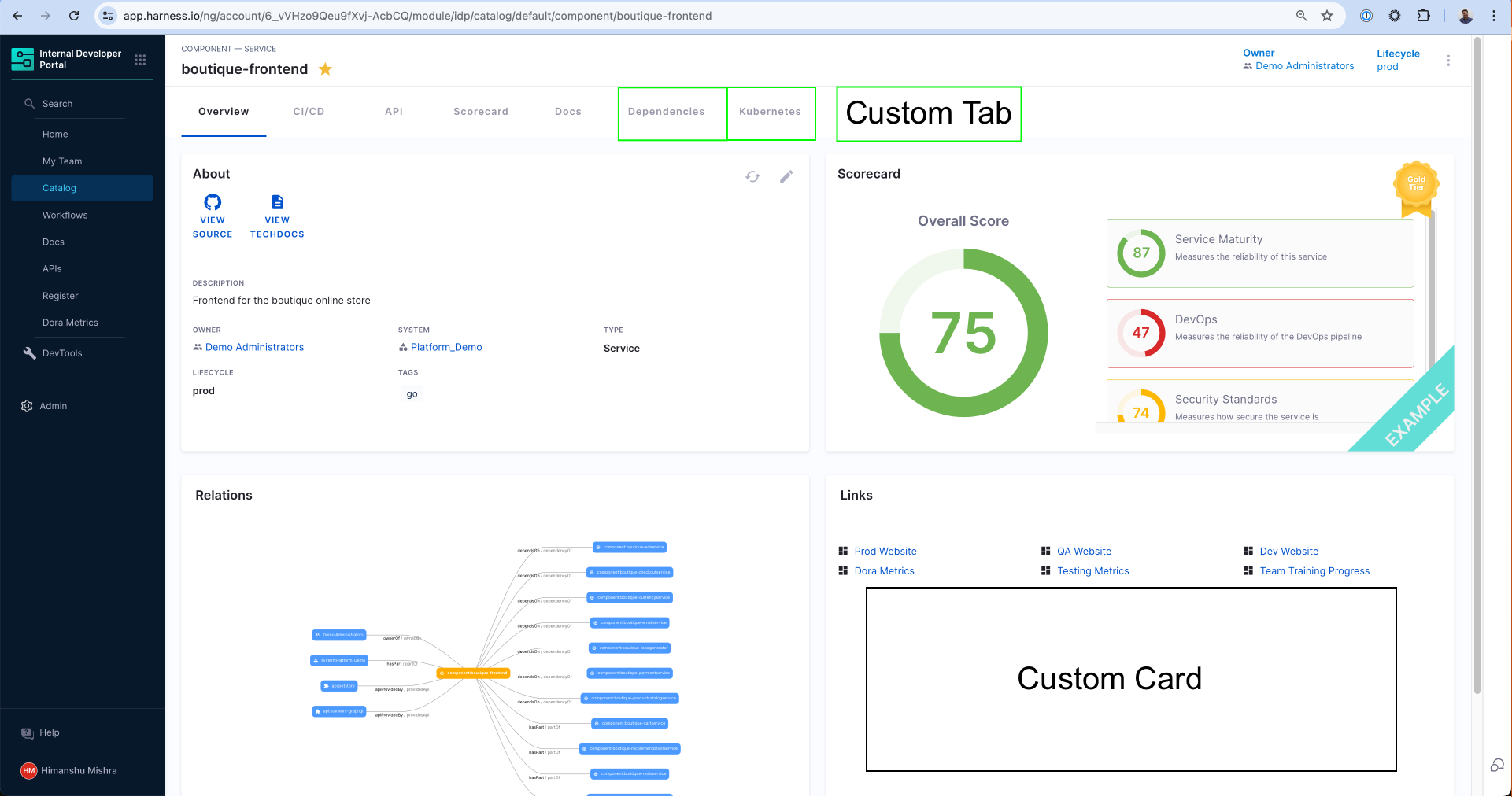
Understand Catalog Entity Kinds and Types
Every Catalog Layout is uniquely designed for a particular Kind and Type of application. For example, the most common catalog layout is for a microservice and is often represented as Kind: Component and spec.type: service. You can learn more about the available kinds in the Catalog YAML docs and its System Model to understand the different use-cases.
The kind of entities are fixed to those available out of the box (Component, API, Resource, etc.), however you can create any arbitrary type for these kinds of entities. Let's say you use the word "micro-frontends" to represent internal websites in your organization. In order to create this new type of Component, you can use microfrontend in the spec.type field of the Catalog Definition YAML and then create a unique layout for those types of applications.
Layout Editor
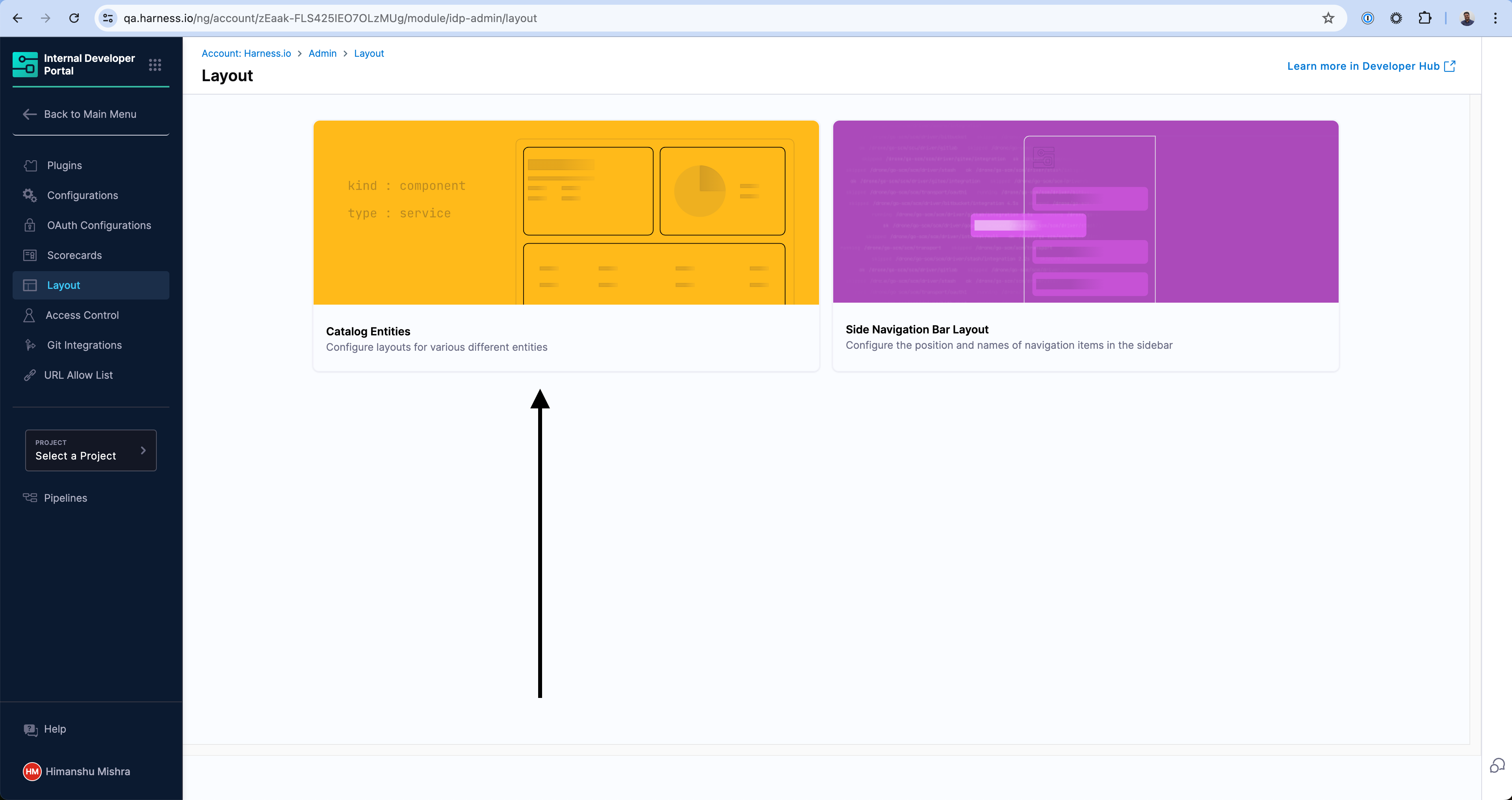
You can access the layout of the Catalog Pages by going to the Admin section of IDP and navigating to the Layout section.
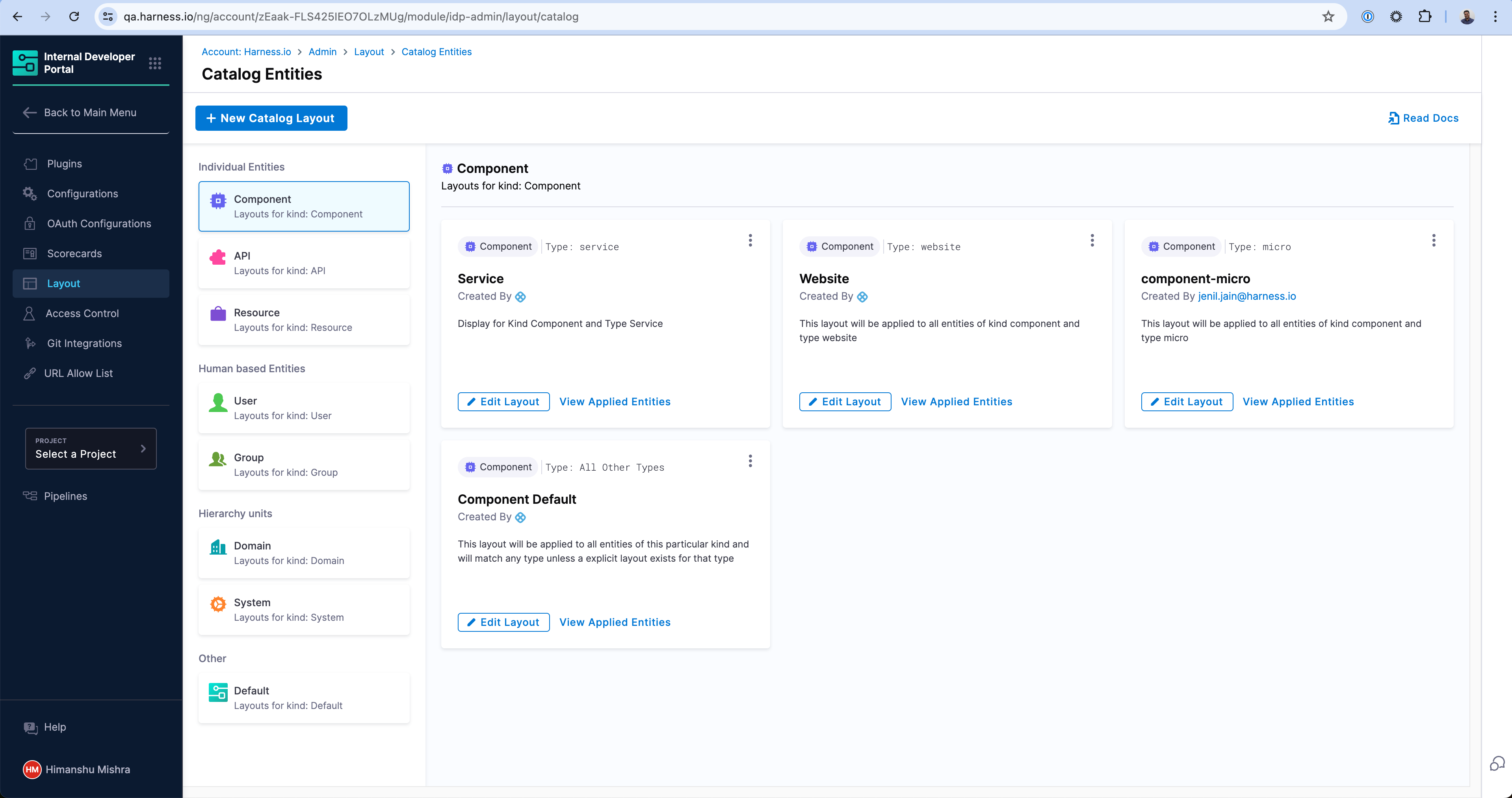
The Layouts are grouped by the kind of the Catalog entities and their use-cases in the sidebar. As you can see there are a number of layouts possible for a particular kind. For example, the first layout in the screen will match any Catalog entity with kind: Component and spec.type: service. Similarly, there is a different layout for spec.type: website. At the end, there is a catch-all layout which will be used for any other type which has not been explicitly created above.
Create a new Layout
You can create a new Layout for a new type of application by either duplicating an existing layout or clicking on the "New Catalog Layout" button above.
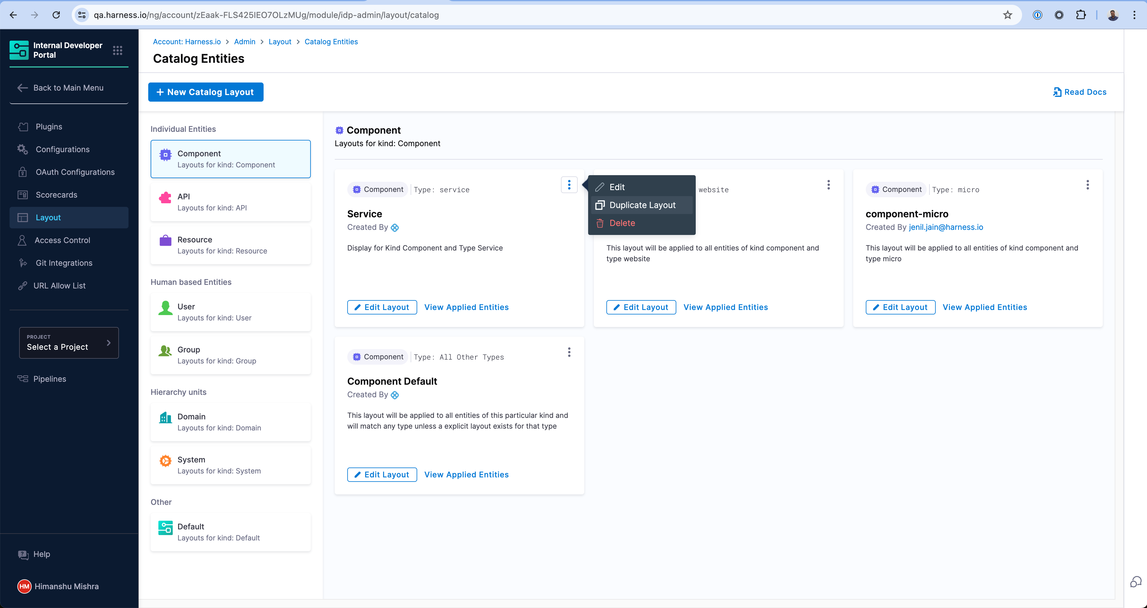
Enter a unique type that this layout will be applicable to. In this example, we're creating one for library to represent internal software libraries.
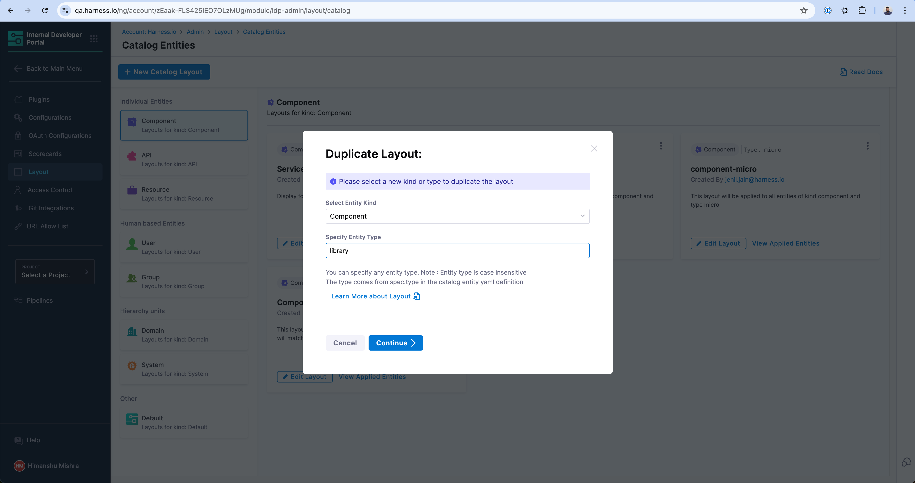
And voilà! Your new Layout is created which will specifically render for entities with kind: Component and spec.type: library.
Layout YAML Reference
Entity Page Layouts are defined in a hierarchical structure starting with the "page" key, representing the entity page. Each page consists of "tabs," an array that controls the rendered tabs for the entity page. Within each tab, there is a "contents" array responsible for rendering the contents within that specific tab.
- "page" represents the entity page and contains the configuration for the tabs.
- "tabs" is an array that defines the rendered tabs for the entity page.
- "contents" is an array that specifies the components rendered within a tab.
- "component" represents an individual component to be rendered.
- "specs" contains additional properties and configurations for the component.
- "props" specifies the props (properties) for the component.
- "gridProps" provides grid-related properties for arranging items in a grid structure.
- "cases" is a property specific to the "EntitySwitch" component, allowing conditional rendering based on specified conditions.
Example of an entity page layout
page:
  name: EntityLayout
  tabs:
    - name: Overview
      path: /
      title: Overview
      contents:
        - component: EntityOrphanWarning
        - component: EntityProcessingErrorsPanel
        - component: EntityAboutCard
          specs:
            props:
              variant: gridItem
            gridProps:
              md: 6
        - component: EntityScoreCard
          specs:
            props:
              variant: gridItem
            gridProps:
              md: 6
        - component: EntityCatalogGraphCard
          specs:
            props:
              variant: gridItem
              height: 400
            gridProps:
              md: 6
              xs: 12
        - component: EntityLinksCard
          specs:
            props:
              variant: gridItem
              item: 400
            gridProps:
              md: 6
              xs: 12
    - name: ci-cd
      path: /ci-cd
      title: CI/CD
      contents:
        - component: EntitySwitch
          specs:
            cases:
              - if: isHarnessCiCdAvailable
                content:
                  component: EntityHarnessCiCdContent
              - content:
                  component: EmptyState
                  specs:
                    props:
                      title: No CI/CD available for this entity
                      missing: info
                      description: You need to add an annotation to your component if you want to enable CI/CD for it. You can read more about annotations in Backstage by clicking the button below.
    - name: API
      path: /api
      title: API
      contents:
        - component: EntityProvidedApisCard
          specs:
            gridProps:
              md: 6
        - component: EntityConsumedApisCard
          specs:
            gridProps:
              md: 6
    - name: Scorecard
      path: /scorecard
      title: Scorecard
      contents:
        - component: EntityScorecardContent
    - name: TechDocs
      path: /docs
      title: Docs
      contents:
        - component: EntityTechdocsContent
          specs:
            children:
              - component: TechDocsAddons
                specs:
                  children:
                    - component: ReportIssue
    - name: Deps
      path: /dependencies
      title: Dependencies
      contents:
        - component: EntityDependsOnComponentsCard
          specs:
            props:
              variant: gridItem
            gridProps:
              md: 6
        - component: EntityConsumedApisCard
          specs:
            props:
              variant: gridItem
            gridProps:
              md: 6
    - name: EntityKubernetesContent
      path: /kubernetes
      title: Kubernetes
      contents:
        - component: EntityKubernetesContent
          specs:
            props:
              refreshIntervalMs: 60000
Create a new Entity type
You can create any entity type by simply defining those in the Catalog Definition YAML (e.g. catalog-info.yaml) for the application. For example, if you are defining a new LLM Model and want to declare a new type llm, you can define this in the catalog-info.yaml under spec.type field and the new type will be available for you to use in Catalog filters as well as Layouts. Here is an example -
apiVersion: backstage.io/v1alpha1
kind: Component
metadata:
  name: my-new-model
  description: Description of your model
  tags:
    - python
  links:
    - url: https://admin.example-org.com
      title: Admin Dashboard
      type: admin-dashboard
spec:
  type: llm-model
  lifecycle: production
  owner: team-a
  system: project-x
Read more on how to register a Software Component in the Catalog.
Resize a card in Overview page
The Catalog pages use a 12-column grid system for responsive layouts. Where md is the recommended unit, and md: 1 stands for 1/12th of the grid. See other possible breakpoints on Material UI docs.
Recommendation: You can use md: 6 for a card that occupies half width of a page and md: 12 to assign full width.
Example -
- component: EntityLinksCard
  specs:
    props:
      variant: gridItem
      item: 400
    gridProps:
      md: 6
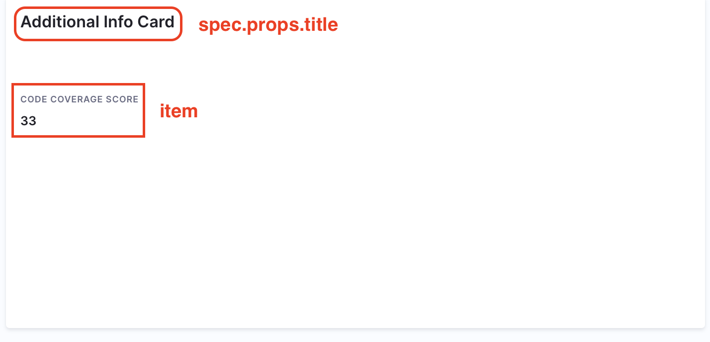
Add an additional Info Card
In case you want to display the same information you have ingested on your Overview page as an additional card, follow the steps below.
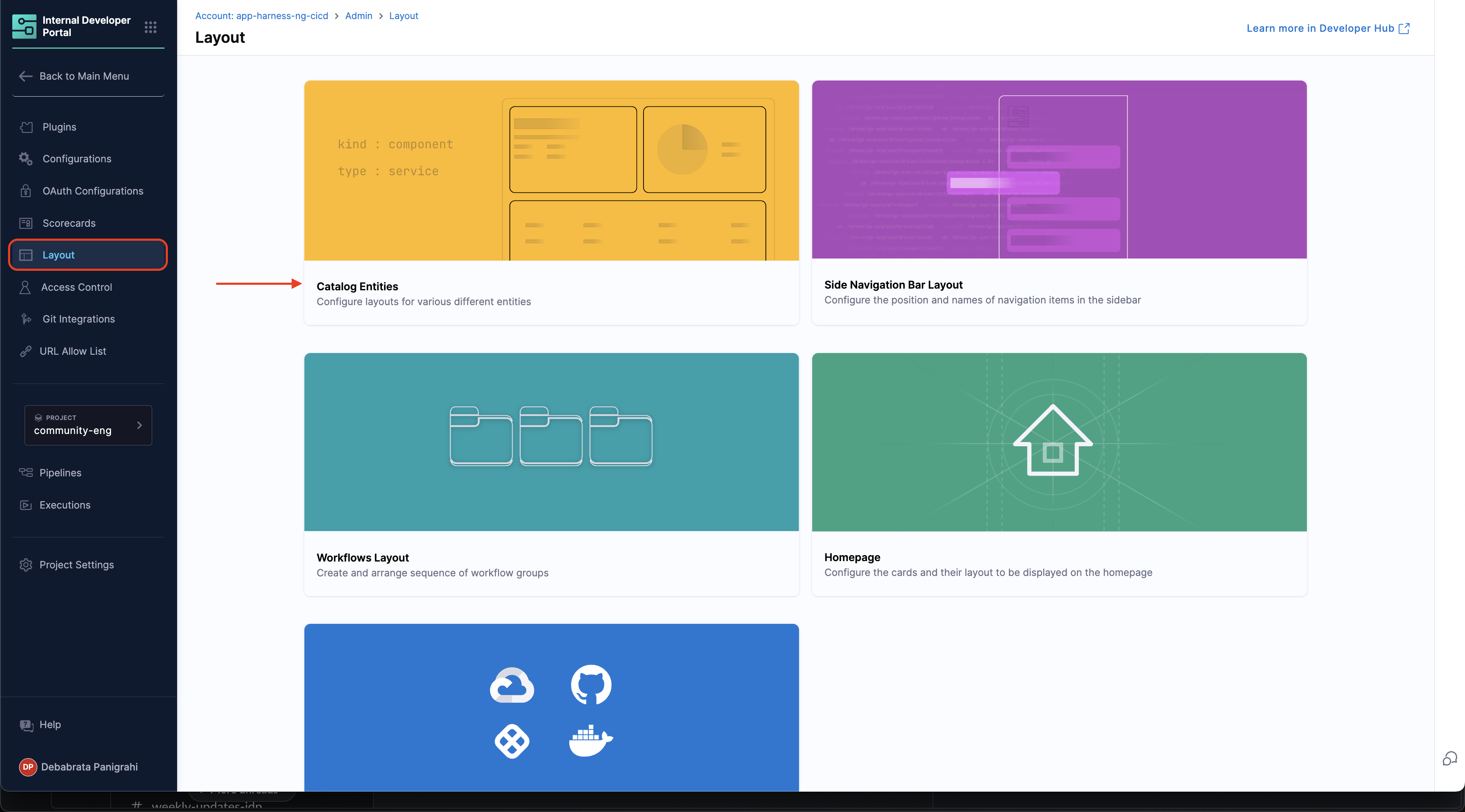
- Go to the Layout Page and under Admin and select Catalog Entities.
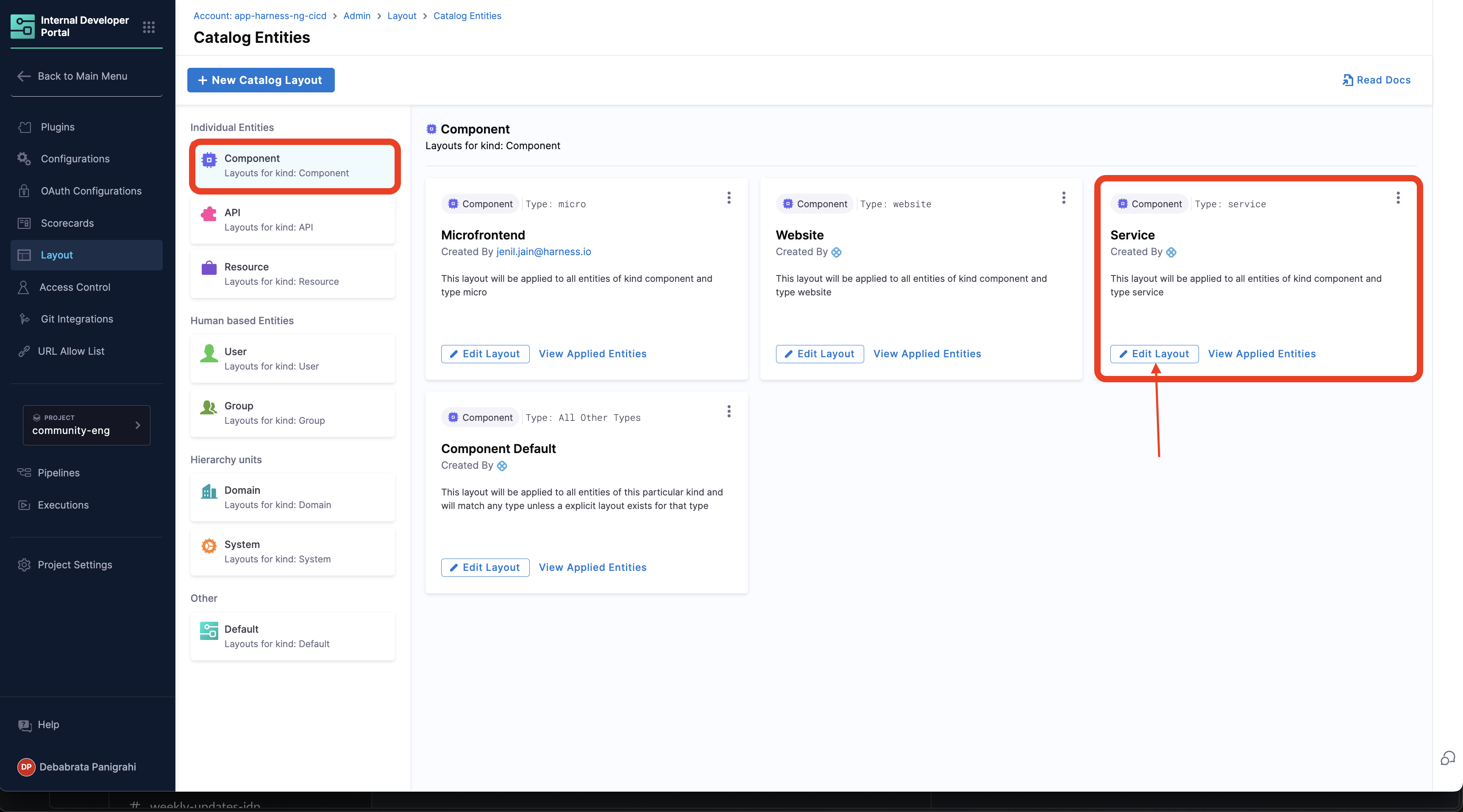
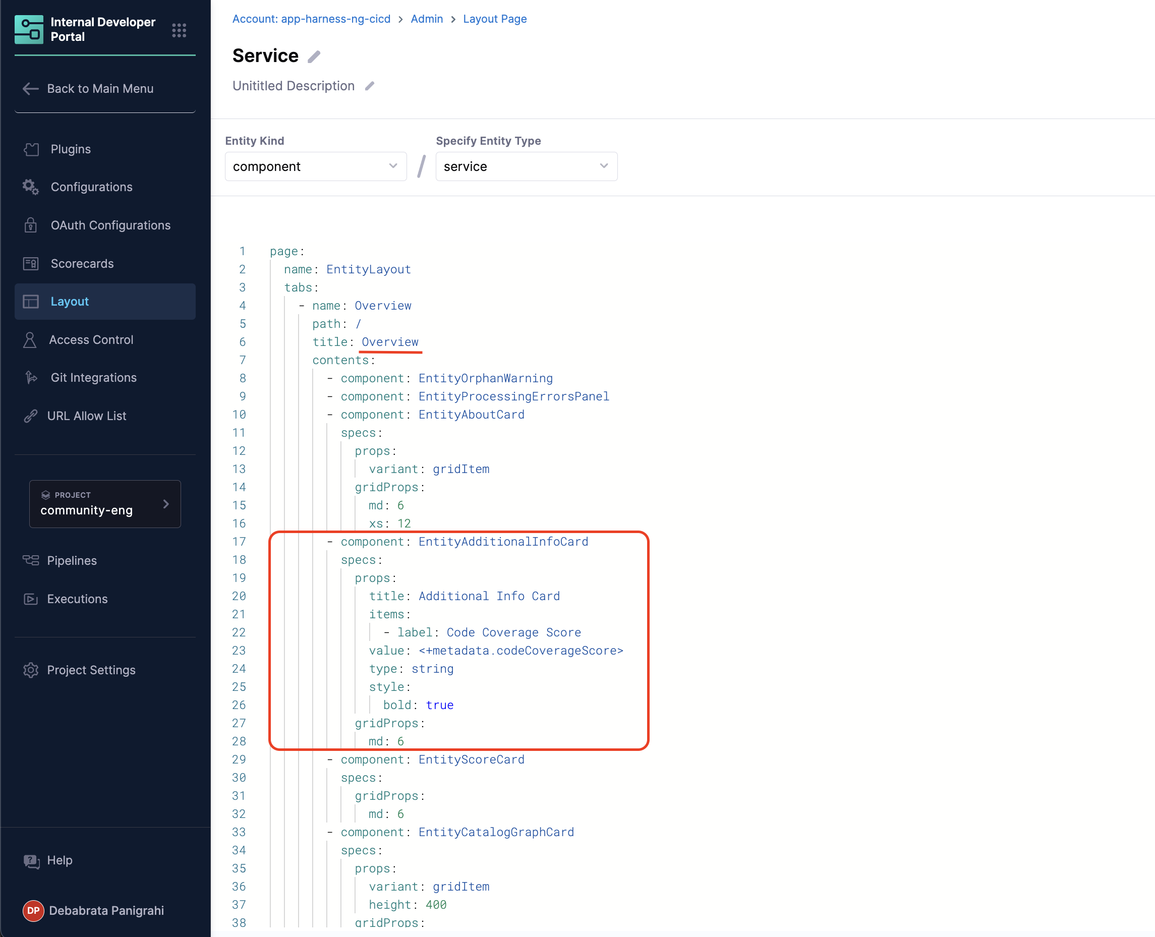
- Now Select Edit Layout for component Service and add the following under Overview card.
        - component: EntityAdditionalInfoCard
          specs:
            props:
              title: Additional Info Card
              items:
                - label: Code Coverage Score
                  value: <+metadata.additionalInfo.codeCoverageScore>
                  type: string
                  style:
                    bold: true
            gridProps:
              md: 6
- Now go to the Warehouse Software Component in the Catalog, and you'll find an additional info card populated with information we ingested using the API above. You can read more about additional info card
Embed an iframe
You can embed an iframe on a Catalog entity’s detail page with the EntityIframeContent component. This enables you to display external web pages directly inside the entity view in Harness IDP.
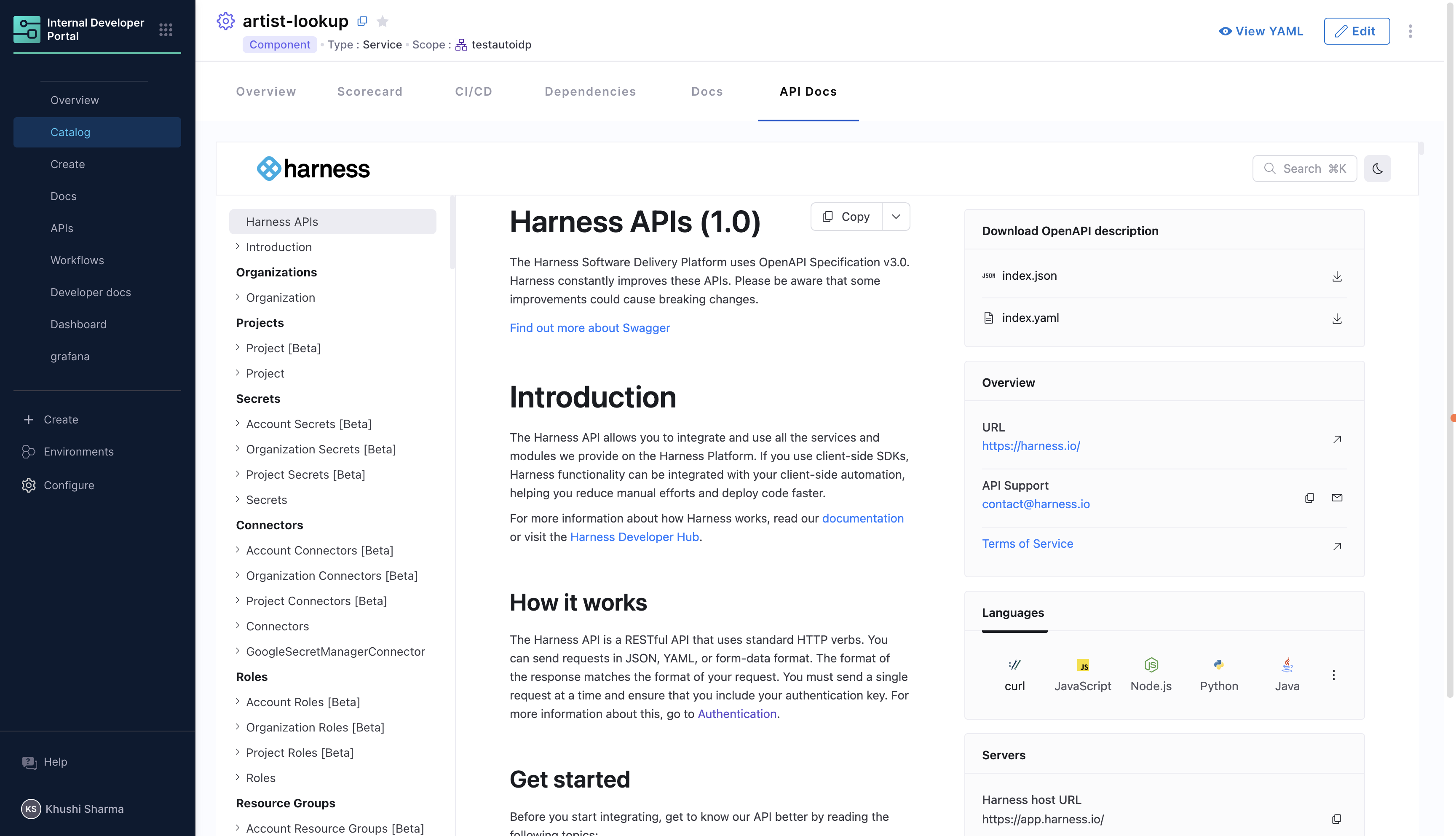
Follow the given steps:
-
Go to Configure → Layout → Catalog Entities.
-
Select the entity whose layout you want to edit, or create a new catalog layout.
-
Add a content block with the following parameters:
title: Public title of the iframe.path: Path segment for the iframe tab/route.name: Name for this content block.component: Must beEntityIframeContent.url: The external page to render in the iframe.
Example
- title: "API Docs"
  path: "iframe"
  name: "iframe"
  contents:
    - component: "EntityIframeContent"
      specs:
        props:
          url: "https://apidocs.harness.io/"
          title: "API Docs"
Use Entity Metadata
You can also reference an entity annotation (docs) for the URL:
Entity YAML
apiVersion: backstage.io/v1alpha1
kind: Component
metadata:
  name: my-service
  annotations:
    docs:
      url: https://docs.example.com/
spec:
  type: service
  owner: team-a
Layout YAML
- title: "Docs"
  path: "docs"
  name: "iframe"
  contents:
    - component: "EntityIframeContent"
      specs:
        props:
          url: <+metadata.annotations.docs.url>
          title: "Docs"
Entity Relations Components
IDP provides two built-in components for visualizing entity relationships and exploring system graphs interactively.
HarnessEntityRelationsCard
HarnessEntityRelationsCard displays an interactive graph of entity relations, including dependencies, ownership, and other relationships. Connected entities are shown as nodes with edges representing their relationships.
Add it to the Overview tab as a card, typically full-width at the bottom.
- component: HarnessEntityRelationsCard
  specs:
    gridProps:
      md: 6
Use md: 6 by default to render this card at full width, giving the graph enough space to display complex relationship networks clearly.
SystemExplorerTabContent
SystemExplorerTabContent provides a full-page interactive graph explorer that works across all catalog entity types. It shows all related entities (components, APIs, resources, domains, users, and groups) along with the entire System Hierarchy, making it easy to traverse System Relations. It also includes filtering by kind/type, a group-by-type toggle, and zoom/pan controls.
Add it as a separate top-level tab, not inside the contents of the Overview tab.
page:
  tabs:
    - name: System Explorer
      path: /system-explorer
      title: System Explorer
      contents:
        - component: SystemExplorerTabContent
SystemExplorerTabContent is designed to occupy a full tab by itself. Do not nest it inside the Overview tab's contents array. Use it as a standalone tab entry as shown above.
Hierarchy Entity Layouts
Hierarchy entities (created by Platform Integration) use specialized layouts to display organizational structure and aggregated metrics. You can customize layouts for each hierarchy type: account, organization, and project.
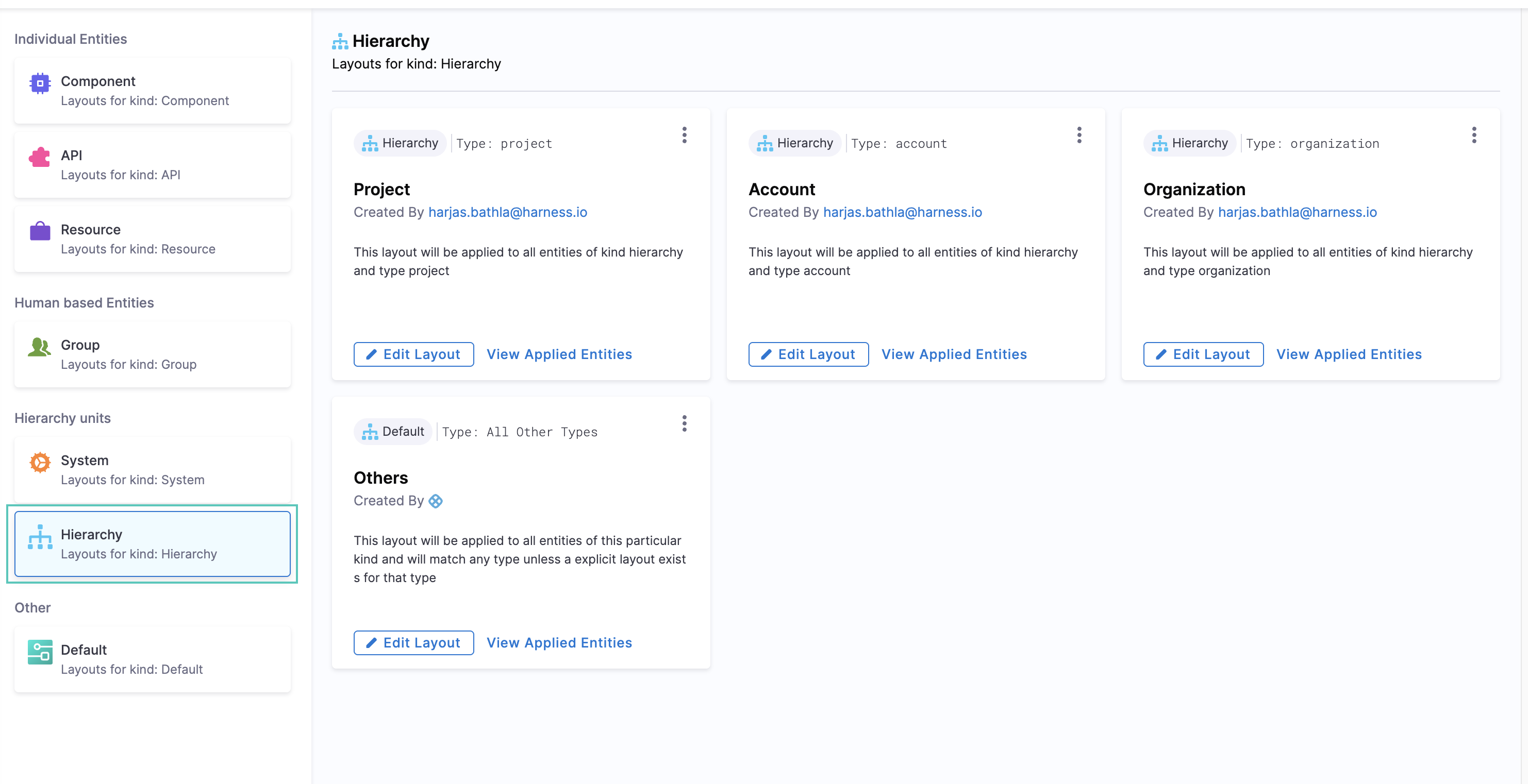
Hierarchy entity layouts support these additional components beyond standard catalog components:
HierarchicalEntitiesTable
Displays the direct child entities in the hierarchy (e.g., organizations under an account, projects under an organization).
- component: HierarchicalEntitiesTable
EntitiesByScopeTable
Shows all entities that belong to the current scope level, with search and pagination support.
- component: EntitiesByScopeTable
StatsCard
Displays aggregated metrics from child entities. The value field references a metadata property created by an aggregation rule.
- component: StatsCard
  specs:
    props:
      title: Code Coverage
      subtitle: Code Coverage of our codebase
      value: <+metadata.codeCoverage>%
Props:
- title - The main heading displayed on the card
- subtitle - A description or additional context for the metric
- value - The metric value to display, supports basic interpolation using
<+metadata.propertyName>syntax
The value field supports basic interpolation using <+metadata.propertyName> syntax, where property names come from your aggregation rules. You can also append static text to the interpolated value (e.g., /month, %, etc.).
AggregatedTable
Shows a breakdown table with individual values from child entities, useful for drill-down analysis. You can add any number of columns to display different metrics from the child entities.
Use cases:
- Display component metrics in a table on project entities
- Display project-level aggregated metrics in a table on organization entities
- Display organization-level aggregated metrics in a table on account entities
- component: AggregatedTable
  specs:
    props:
      tableTitle: Unit Test Coverage for Projects
      tableProps:
        columns:
          - NAME_COLUMN
          - name: Unit Test Coverage Percentage
            accessorKey: metadata.unitTestCoveragePct
            type: text
          - name: Deployment Frequency
            accessorKey: metadata.deploymentFrequency
            type: text
          - name: Change Failure Rate
            accessorKey: metadata.changeFailureRate
            type: text
Column configuration:
- NAME_COLUMN - A predefined column that automatically displays the entity name (always include this as the first column)
- name - The display name for the column header
- accessorKey - The property path to read the value from child entities (e.g.,
metadata.propertyName) - type - Currently only
textis supported
Displaying aggregated values in tables:
When viewing an organization entity, you can display a table of child projects with their aggregated metric values. The accessorKey can reference aggregated properties that were created by aggregation rules.
For example, if you have an aggregation rule that creates metadata.Avg Deployment Frequency on project entities, you can display this in a table on the organization entity:
- component: AggregatedTable
  specs:
    props:
      tableTitle: Unit Test Coverage for Projects
      tableProps:
        columns:
          - NAME_COLUMN
          - name: Unit Test Coverage Percentage
            accessorKey: metadata.unitTestCoveragePct
            type: text
          - name: Avg Deployment Frequency
            accessorKey: metadata.Avg Deployment Frequency
            type: text

Key points:
- Property names in
valuefields must match those defined in your aggregation rules - Use
NAME_COLUMNfor the entity name column in aggregated tables accessorKeyreferences the original property from child entities
Troubleshooting
- Component Not Rendering: Check for correct
props. - Layout Issues: Adjust
gridPropsfor responsive design.