> For the complete documentation index, see [llms.txt](https://developer.harness.io/llms.txt). Markdown versions of documentation pages are available by appending `.md` to page URLs; this page is available as [Markdown](https://developer.harness.io/internal-developer-portal/admin-and-customization/layout-and-appearance/home-page-customization.md).
# Customize your IDP Homepage
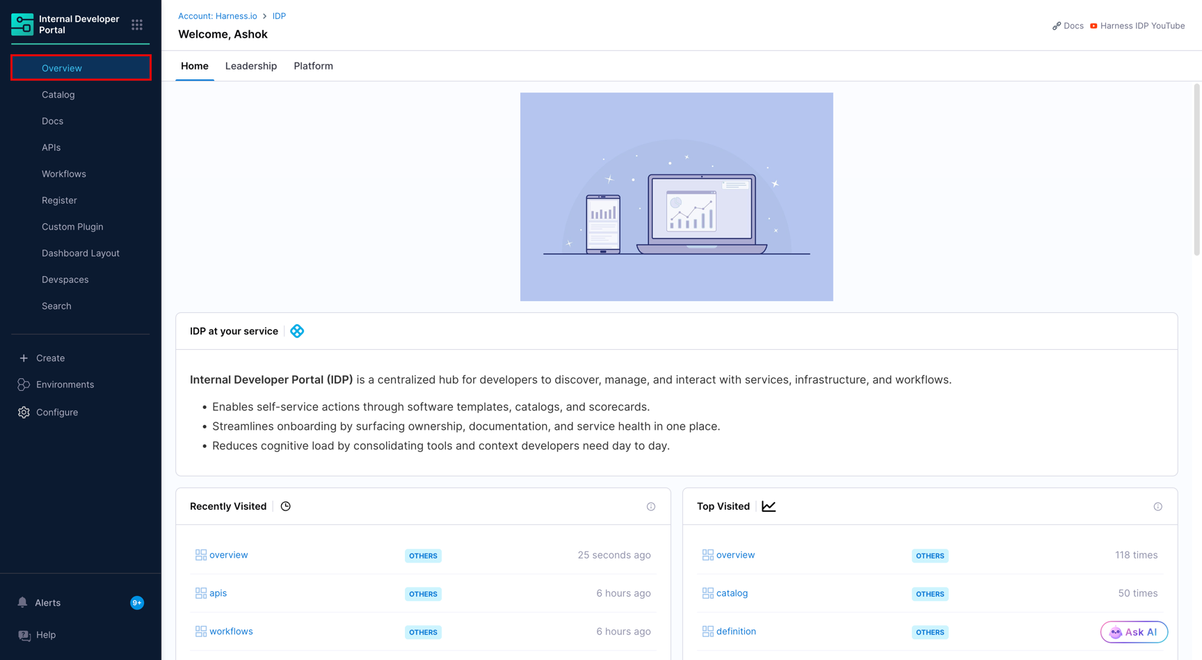
Configure the IDP Overview page for developers, platform engineers, and engineering leaders using persona views.
Developers need their daily context: recent builds, deployments, incidents, and pull requests for the services they own. Platform engineers need catalog coverage, scorecard compliance, and integration health. Engineering leaders need org-wide delivery metrics, incident trends, and security posture.
**Persona View** solves this by giving each role its own tab on the IDP Overview page, pre-loaded with the cards most relevant to their work. Admins configure what each tab shows and assign it to the right user group(s).
***
### Quick tutorial
{% embed url="" %}
***
### Before you begin
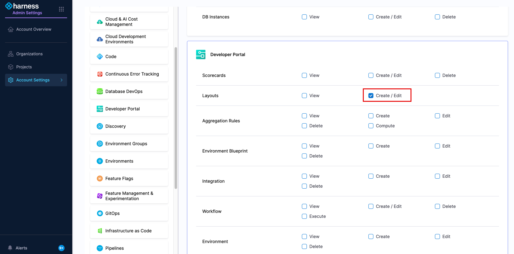
You must have the IDP Admin role or the `IDP_LAYOUT_EDIT` permission.
***
### Steps to configure persona view
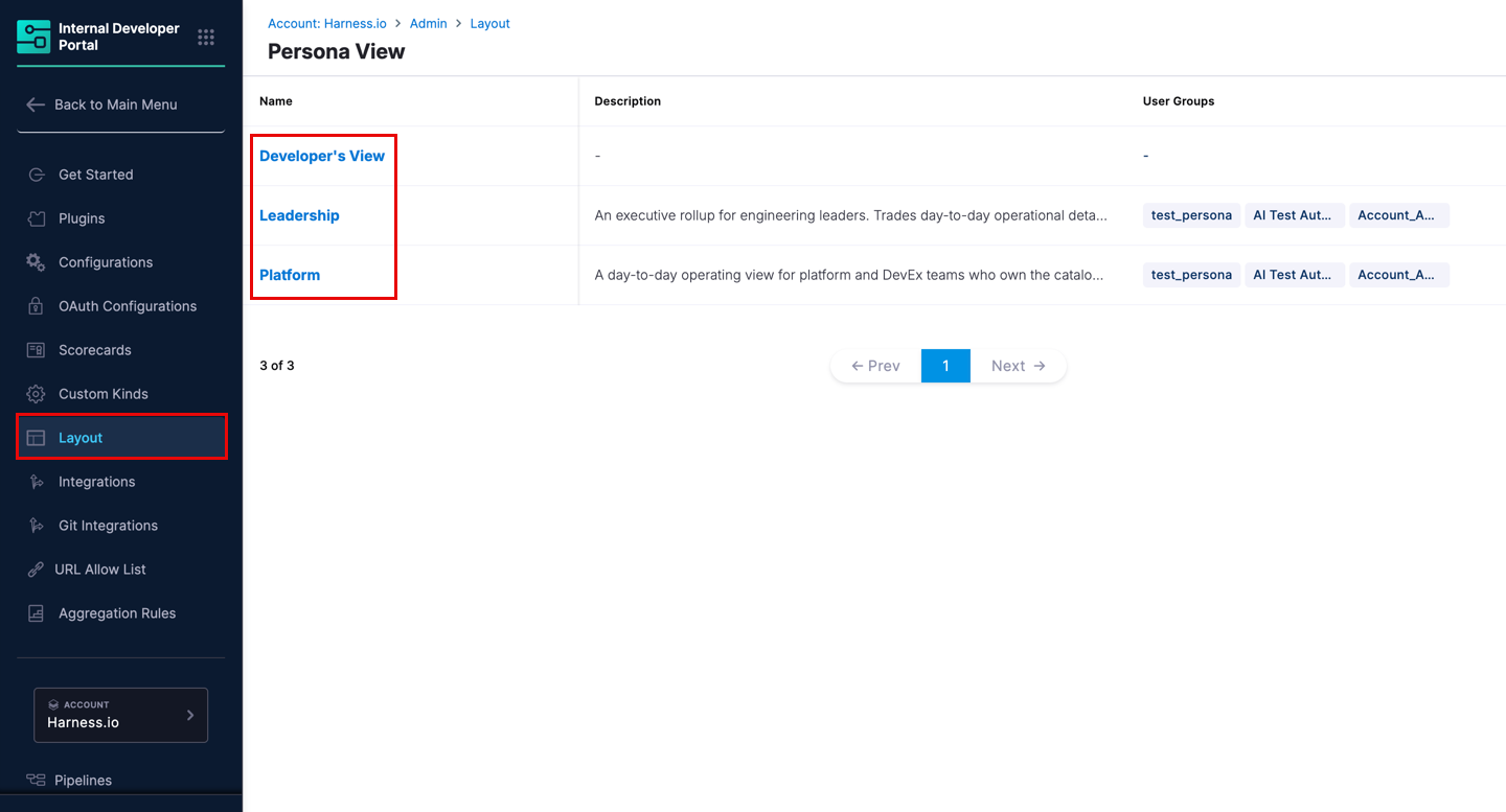
Navigate to **Configure** → **Layout** → **Homepage**. This opens the **Persona View** list. Click any row to open its editor.
* [Configure developer's view](#configure-developers-view)
* [Configure platform view](#configure-platform-view)
* [Configure leadership view](#configure-leadership-view)
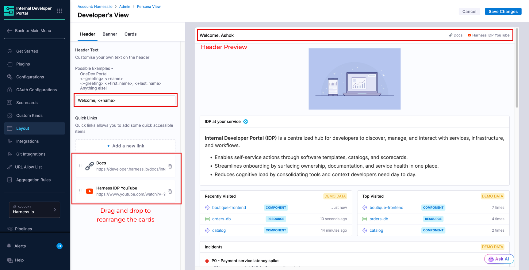
A live preview with sample data updates on the right side of the editor as you make changes.
***
### Configure developer's view
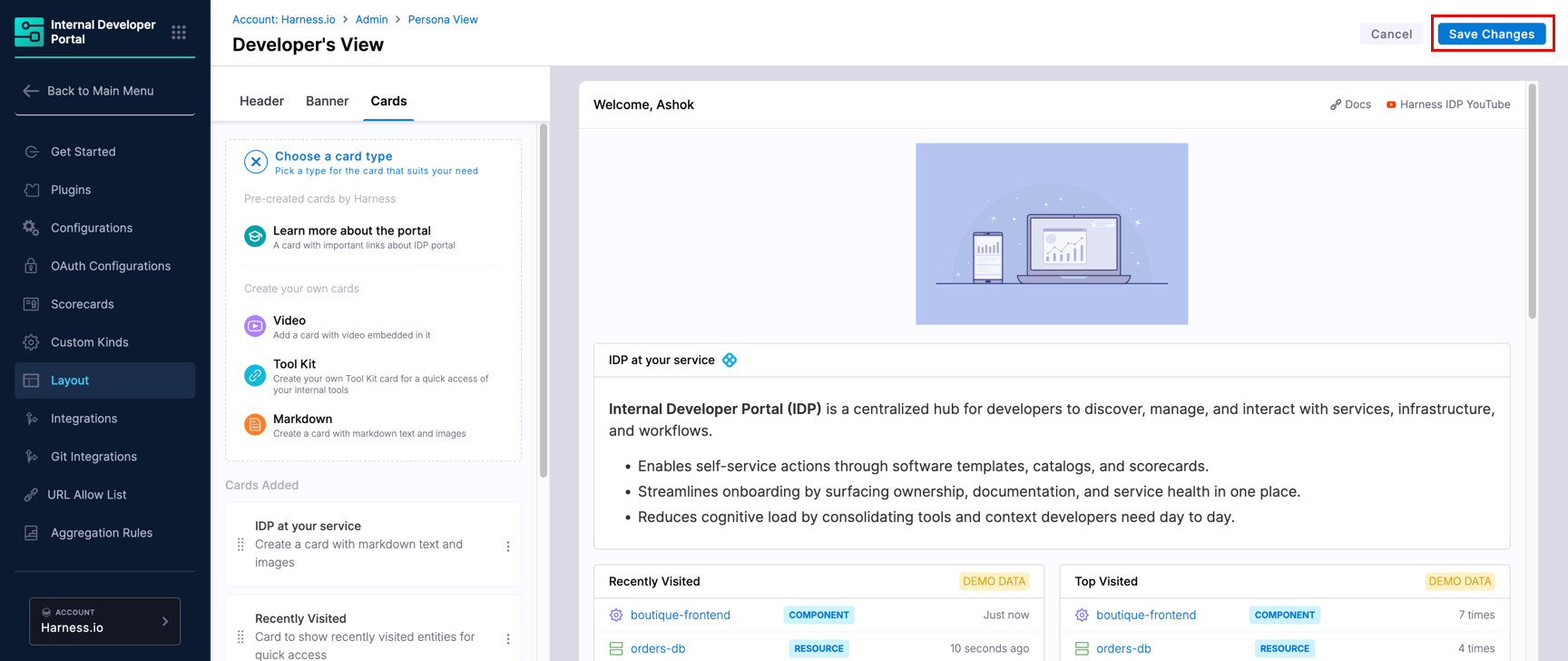
Developer's View is the **Home** tab, visible to every user. You can customize its header, banner, and cards.
#### Header
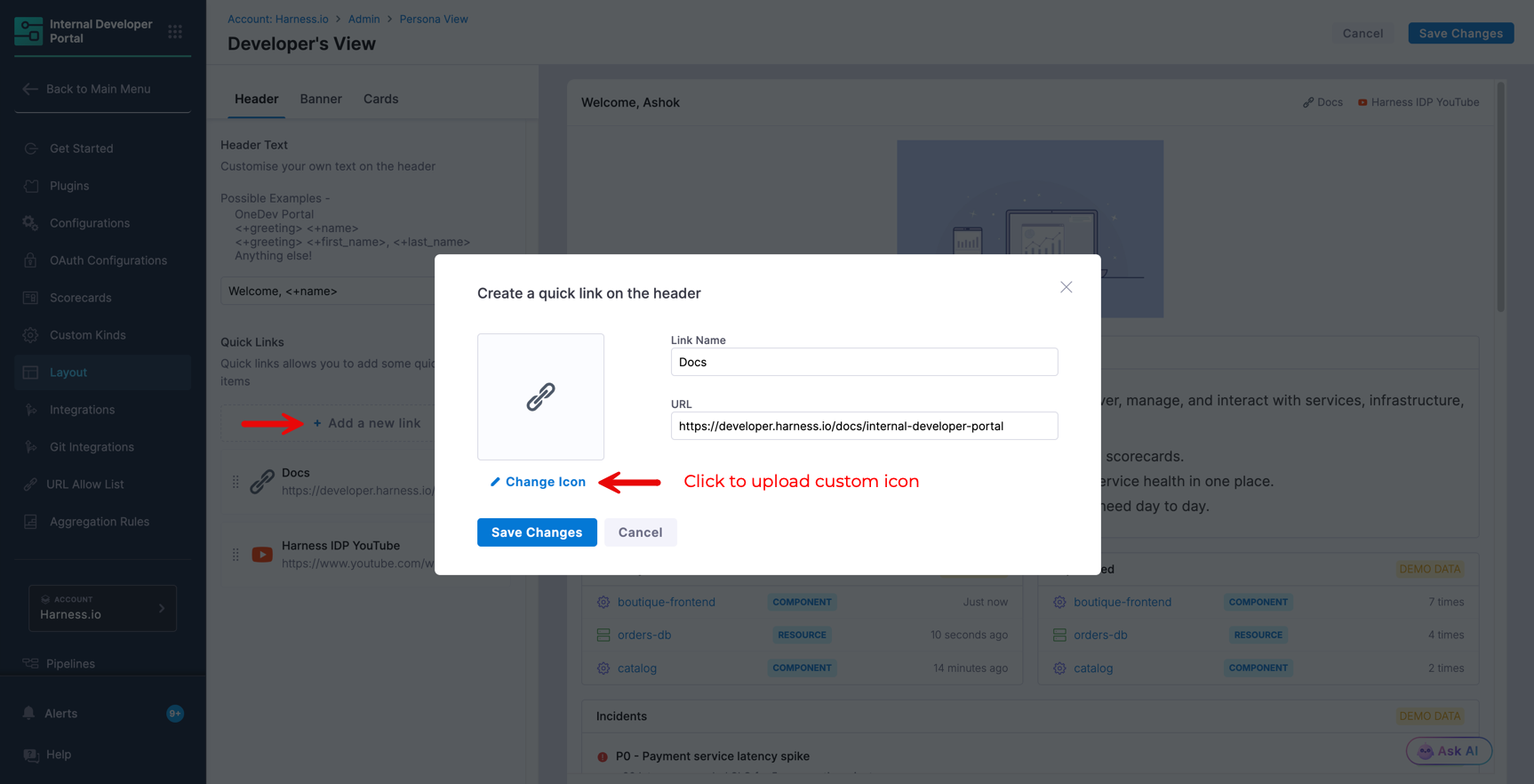
Under **Header**, add a personalized welcome message and quick links to pages your developers visit frequently, such as release notes, engineering docs, or a status page.
**Header Text** supports both static and dynamic values:
* Static: `Welcome to Harness IDP!`
* Personalized: `Welcome <+first_name>!`
* Last name first format: `Welcome <+last_name>, <+first_name>!`
* With time-aware greeting: `<+greeting> <+first_name>` The `<+greeting>` variable resolves to Good Morning, Good Afternoon, or Good Evening based on the user's timezone.
**Quick Links** lets you add shortcuts with a custom icon (recommended size: 128x128px, max file size: 200KB), a display name, and a URL. Drag and reorder links to control how they appear. Good candidates are onboarding docs, a Slack channel link, or a status page.
#### Banner
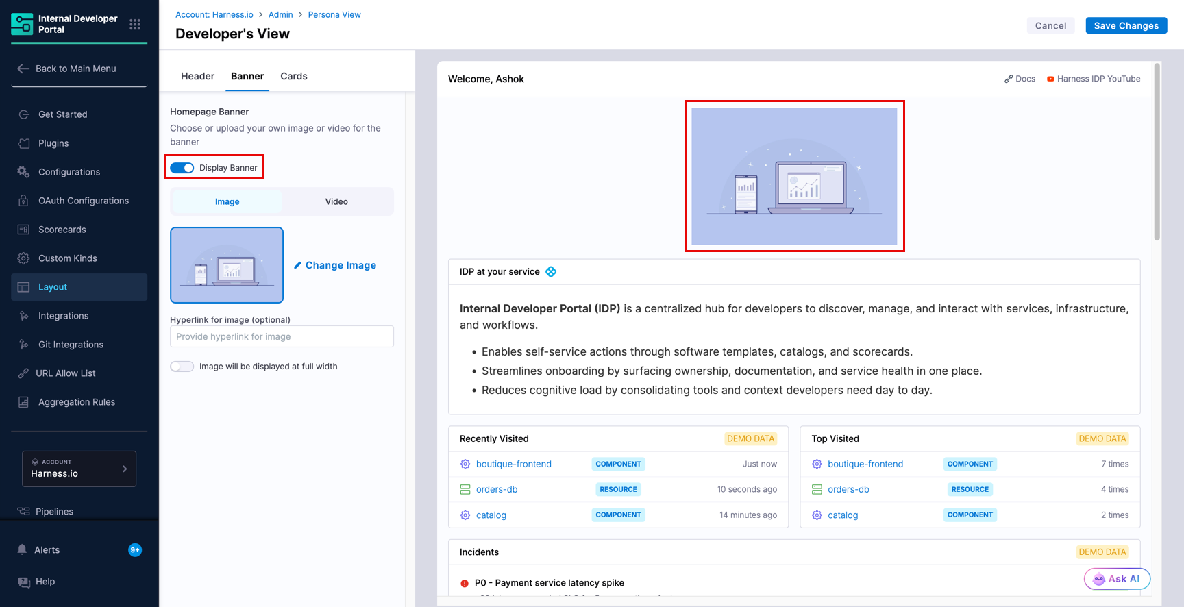
Under **Banner**, you can replace the default IDP banner with an image or a video, or disable it entirely to give cards more space on the page.
* **Image**: Supported types are `.jpg`, `.jpeg`, and `.png`. Recommended size is 756x300px. Maximum file size is 10MB. You can optionally add a hyperlink so users are taken to a URL when they click the banner. A good use: a banner for an upcoming engineering event you want all developers to notice.
* **Video**: Supported types are public embedded links. Examples: `https://www.youtube.com/embed/sVnI93bCr38?si=zobQ1YJMVVJMccaO` or `https://www.dropbox.com/scl/fo/example/video.jpg?raw=1`. Rendered size is 500x250px.
#### Cards
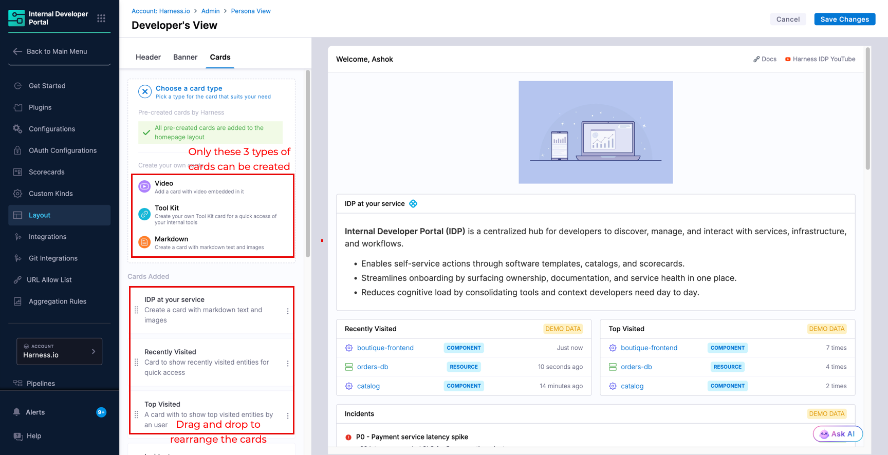
Under the **Cards** tab, click **New Card** and choose the cards you need from the list of pre-created cards or you may add your own card. The ones you choose would be shown in the `Cards Added` list.
The following card types are available for Developer's View. Go to [Card reference](#card-reference) to know what each card shows and any setup it may require.
* **Pre-created by Harness** (no configuration needed to add): Recently Visited, Top Visited, Learn More, Starred Entities, Incidents, Recent Builds, Recent Deployments, My Workflow Runs, My Ownership, Jira tasks, GitHub pull requests, Harness Code pull requests
* **Custom cards** (you define the content): Markdown, Toolkit, Video
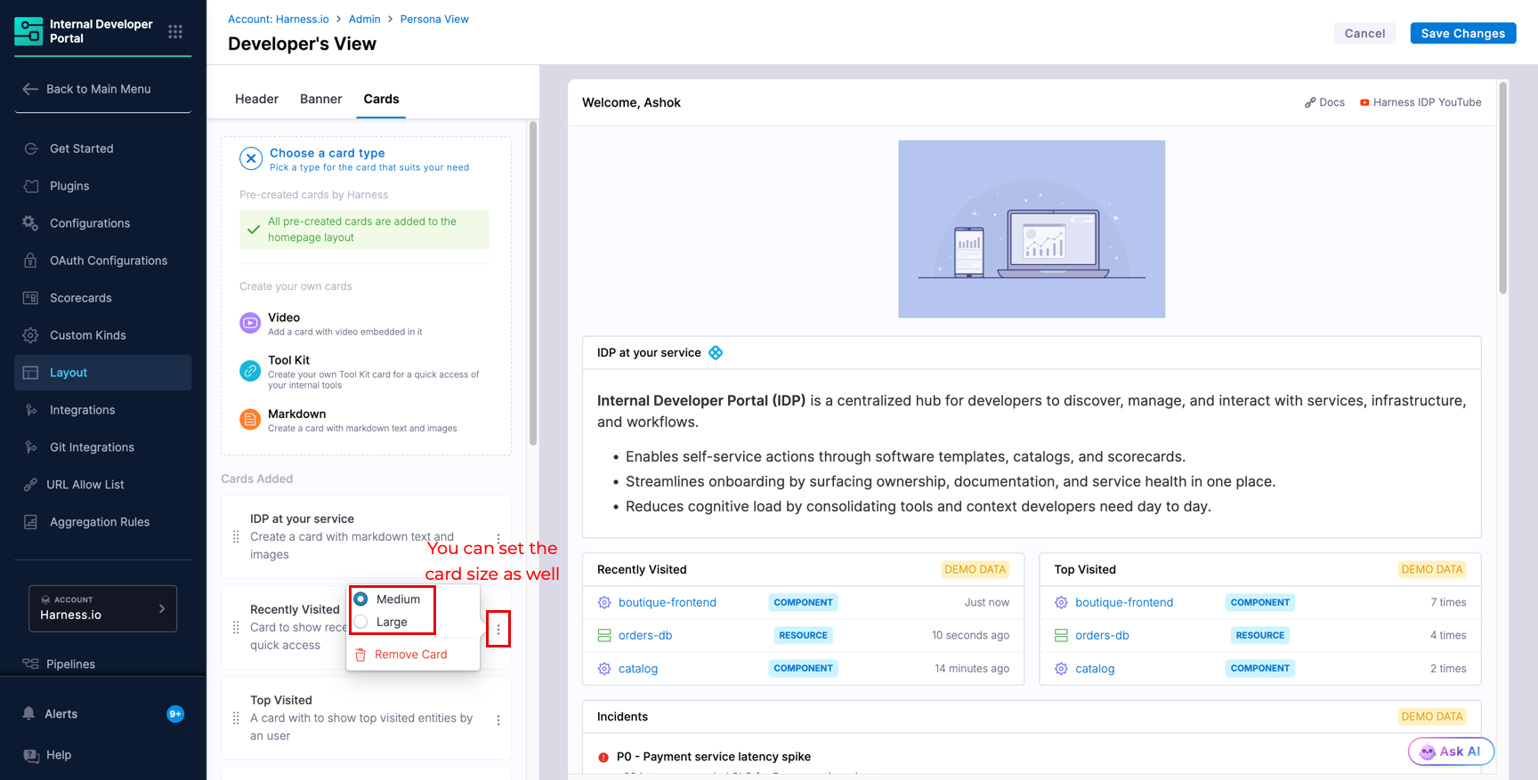
You may remove, rearrange, and resize the cards shown on the Home tab. Cards can be medium (6md) or large (12md) width.
Click **Save Changes** every time you want to commit a change. If you try to leave the editor without saving, a warning dialog appears. The right side of the editor is a live preview only and cannot be edited directly.
Unlike Platform and Leadership, saving Developer's View does not open a user group assignment dialog. The Home tab is always visible to all users.
***
### Configure platform view
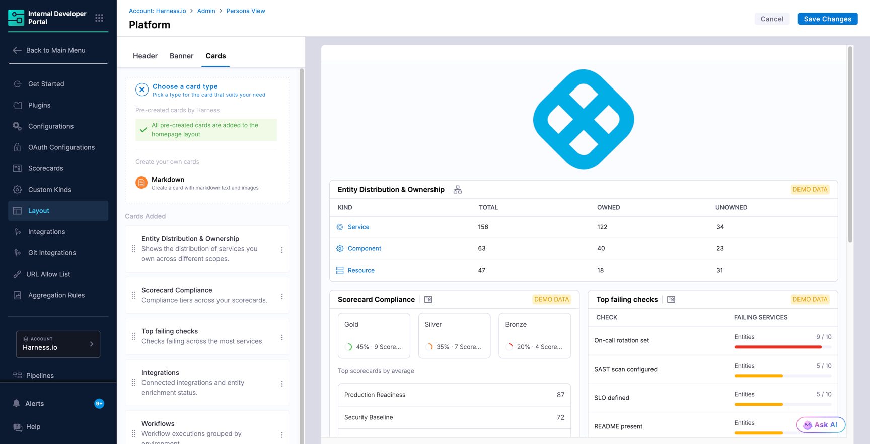
Platform view gives platform engineers and DevEx teams a day-to-day operating view of catalog coverage, scorecard health, connected integrations, and workflow trends, all in one place instead of scattered across tools.
#### Default cards
The following cards are available in Platform view by default. Click the ones you want to add them to your view. You can drag the card to rearrange or remove any of them using (**⋮**).
| Card | What it shows |
| ------------------------------- | ------------------------------------------------------- |
| Entity Distribution & Ownership | Catalog entities broken down by kind, owned vs. unowned |
| Scorecard Compliance | Compliance tier distribution across scorecards |
| Top Failing Checks | Scorecard checks failing across the most services |
| Integrations | Connected integrations and entity enrichment status |
| Workflows | Workflow executions grouped by environment |
The only additional card type you can add to Platform view is **Markdown**.
#### Set up and assign
To set up a Platform view and assign it, complete the following steps:
1. In the view list, click **Platform**.
2. On the **Header** tab, enter a header text and quick links. Leave it empty and users see the Home tab header instead.
3. On the **Banner** tab, toggle **Display Banner** on to use a custom image or video. Leave it off and users see the Home tab banner instead.
4. On the **Cards** tab, drag to reorder, use the three-dot menu to remove a card, or click **New Card** to add a Markdown card.
5. Click **Save Changes**. The **Assign and Save** dialog opens.
6. Select one or more Harness user groups and click **Save**. Users in those groups will see the Platform tab on their Overview page.
To update the assignment later, open Platform view again, click **Save Changes**, and pick a new set of groups.
***
### Configure leadership view
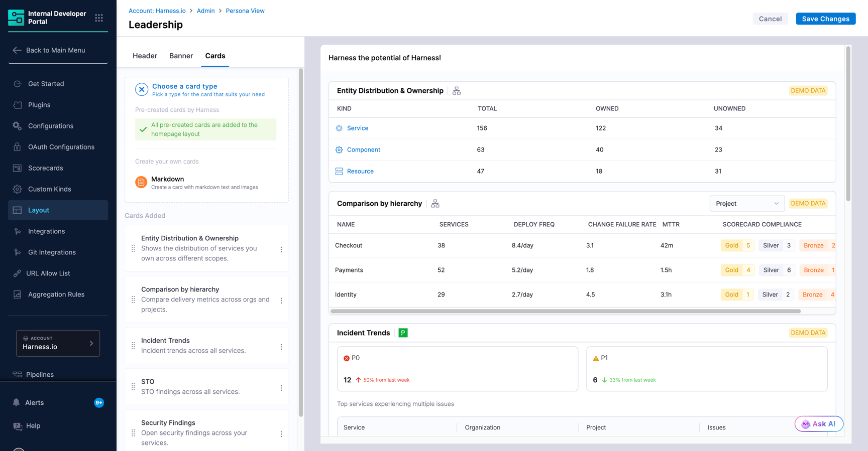
Leadership view gives engineering leaders an org-wide rollup of catalog ownership, delivery performance, incident trends, and security posture without needing to query multiple tools.
#### Default cards
The following cards are added to Leadership view by default. Click the ones you want to add them to your view. You can drag the card to rearrange or remove any of them using (**⋮**).
| Card | What it shows |
| ------------------------------- | ------------------------------------------------------- |
| Entity Distribution & Ownership | Catalog entities broken down by kind, owned vs. unowned |
| Scorecard Compliance | Compliance tier distribution across scorecards |
| Comparison by Hierarchy | Delivery metrics compared across orgs and projects |
| Incident Trends | Incident volume trends across all services |
| STO | STO findings across all services |
| Security Findings | Open security findings across all services |
The only additional card type you can add to Leadership view is **Markdown**.
#### Set up and assign
Follow the same steps as [Platform view](#set-up-and-assign). Open the Leadership row, adjust Header, Banner, and Cards as needed, then click **Save Changes** and assign the appropriate user group(s).
{% hint style="info" %}
A user assigned to both Platform and Leadership groups will see all three tabs: **Home**, **Leadership**, and **Platform**.
{% endhint %}
***
### Card reference
The following cards are available for the Home tab. Cards marked **Default** are present when you first open Developer's View and can be removed or rearranged but not edited. All other cards can be added, removed, and rearranged.
| Card | What it shows | Setup |
| -------------------------- | ------------------------------------------------------------------------------------------------------------------------------------------------------------------------------------------------------------------------------------------------- | --------------------------------------------------------------------------------------------------------------------------------------------------------------------------------------------------------------------------------------------------------------------------------------------------------------------------------------- |
| GitHub pull requests | Open and closed PRs across all GitHub repositories the user has access to, both public and private across multiple organizations. Counts at the top reflect open PRs only. Data refreshes on page reload or org filter change, not automatically. | Requires [GitHub OAuth configuration](/internal-developer-portal/use-idp/plugins/oauth-support-for-plugins.md). IDP Admin sets up org-wide OAuth credentials and enables the card. Developers are then redirected to GitHub to sign in. Developer access is scoped to repositories and PRs they have permissions for in GitHub. |
| Harness Code pull requests | Open and closed PRs across all Harness Code repositories the user has access to. Fetches data automatically once enabled, no OAuth needed. | None |
| Incidents | Active incidents for services owned by the signed-in user | Requires an incident integration (e.g., Pagerduty) connected in your account |
| Jira tasks | Assigned Jira work items with summary metrics (Total, To Do, In Progress, New), filter views (Worked On, Assigned To Me, Current Sprint, Project), and per-ticket detail (ID, title, type, priority, status; all clickable links to Jira). | Requires [Atlassian OAuth configuration](/internal-developer-portal/use-idp/plugins/oauth-support-for-plugins.md). IDP Admin adds Atlassian OAuth App credentials in IDP settings and enables the card. Developers sign in from the homepage. Developer access is scoped to tickets they are assigned to, created, or are mentioned in. |
| Learn More | Important links about Harness IDP | None |
| Markdown | Custom content using full Markdown syntax. Use for announcements, handbook links, welcome messages, or any contextual information | None. You author the content |
| My Ownership | Catalog entities owned by the signed-in user or their team, with scorecard scores | None |
| My Workflow Runs | Recent workflow executions triggered by the signed-in user | None |
| Recent Builds | Recent CI pipeline runs for services owned by the signed-in user | None |
| Recent Deployments | Recent deployment executions for services owned by the signed-in user | None |
| Recently Visited | IDP pages the signed-in user visited recently | None |
| Starred Entities | Components, workflows, or TechDocs the user has starred | None |
| Toolkit | Bookmark links for pages your team visits frequently, each with a custom icon (128x128px, max 200KB), display name, and URL | None. You define the links |
| Top Visited | Most viewed IDP pages by the signed-in user | None |
| Video | Embedded video via a public embedded link | None |
{% @harness-feedback/feedback %}