> For the complete documentation index, see [llms.txt](https://developer.harness.io/llms.txt). Markdown versions of documentation pages are available by appending `.md` to page URLs; this page is available as [Markdown](https://developer.harness.io/internal-developer-portal/use-idp/self-service-workflows/create-workflow/custom-field.md).
# Configuring Inputs with CustomField
Use the schema-driven CustomField component to build text, dropdown, button, and JSON inputs from a single Workflow field extension.
Workflow input fields often need to do more than accept typed text. A dropdown may need to list live data from an external system, a value may need to be validated before the form is submitted, or a step may need a code editor for a configuration block.
In IDP workflow builder, `SelectFieldFromApi` renders an API-backed dropdown and `ValidateAndFetch` renders a button that called an API, and each is configured differently.
`CustomField` provides all of them from a single field extension. Set `ui:field: CustomField` on an input property, and use `fieldType` to select the input that renders. Check [Complete example](#complete-example) to know how it fits together in the workflow YAML.
```yaml
customFieldText:
title: Custom Field (text)
type: string
ui:field: CustomField
ui:options:
fieldType: text
placeholder: Enter text
customFieldDropdown:
title: Custom Field (dropdown)
type: string
ui:field: CustomField
ui:options:
fieldType: dropdown
options:
- label: Option 1
value: v1
- label: Option 2
value: v2
```
`fieldType` is the only required option. Everything else is configured under `ui:options`, and the options that apply depend on the `fieldType` you choose.
#### Field types at a glance
| `fieldType` | Renders | Use it for |
| ----------- | ------------------------------------ | ------------------------------------------------------------------------------- |
| `text` | Single-line or multi-line text input | Names, emails, slugs, free-form notes, values that need regex or API validation |
| `dropdown` | Single-select or multi-select picker | Static option lists, API-backed lists, searchable lists, dependent pickers |
| `button` | An in-form button that calls an API | Pre-submission validation, pre-checks, creating a resource before submission |
| `json` | An embedded JSON or YAML code editor | Configuration objects, pipeline snippets, structured input |
***
### When to use CustomField
`CustomField` covers the behavior previously split across `SelectFieldFromApi` and `ValidateAndFetch`, and adds field types that neither component provided.
| Aspect | `SelectFieldFromApi` | `ValidateAndFetch` | `CustomField` |
| -------------- | ----------------------------------------------------------------------- | ------------------------------------------------- | -------------------------------------------------------------------------------- |
| Purpose | Fetch a list from an API, then select | Button-triggered API call, optionally set context | One component, many field types (text, dropdown, button, json) |
| UI stack | Mix of Material UI (MUI) and Harness | MUI-heavy | Harness UI only, built on `@harness/uicore` and Harness design tokens |
| Config surface | `path`, `request`, OAuth, `valueSelector`, `setContextData`, and others | `request`, `button`, `setContextData` | Single schema: `fieldType` plus type-specific options |
| Validation | Not available | Not available | Regex, named validators, API validation on change or on button, debounce |
| Context | `setContextData` (Nunjucks) | `setContextData` | `setContextData` with selectors and Nunjucks templates, plus `updateFormContext` |
| Dependencies | Path-based dependency keys | Parameters in the request | `dependsOn` for dropdowns, form context for all field types |
| Extensibility | One-off component | One-off component | New field types are added in one place |
Use `CustomField` for new workflows. Template authors set `ui:field: CustomField` once and configure behavior through `ui:options`, instead of choosing between several components. Because the configuration is validated against a schema, an incorrect YAML configuration surfaces a clear validation error in the workflow form rather than failing silently.
`CustomField` keeps the same `formContext`, `updateFormContext`, and `setContextData` semantics as `SelectFieldFromApi` and `ValidateAndFetch`, so downstream fields and `ContextViewer` continue to behave the same way.
***
### Before you begin
* Be familiar with [configuring workflow inputs](/internal-developer-portal/use-idp/self-service-workflows/create-workflow/flows-input.md) and the `spec.parameters` structure of `workflow.yaml`.
* For any field that calls an external API through `apiOptions`, `apiValidation`, or `apiAction`, configure a [Backend Proxy](/internal-developer-portal/use-idp/self-service-workflows/workflows-tutorials/dynamic-picker.md#step-1-create-a-backend-proxy) first. The proxy holds the target base URL and the authorization headers.
{% hint style="info" %}
API paths in `CustomField` use the format `proxy//`, the same format used by the [Dynamic Workflow Picker](/internal-developer-portal/use-idp/self-service-workflows/workflows-tutorials/dynamic-picker.md#step-2-create-the-dropdown-picker-in-workflows-form). Here `` is the proxy endpoint you declared under **Configure** > **Plugins** > **Configure Backend Proxies**. Do not prefix the path with `/api/proxy/`. A path that does not resolve returns an inline error on the field.
{% endhint %}
***
### Common options
These options apply to every `fieldType`.
| Option | Type | Description |
| ---------------- | ------------------------------------ | -------------------------------------------------------------------------------------------------------------------- |
| `fieldType` | `text`, `dropdown`, `button`, `json` | Required. Selects the input that renders. |
| `title` | string | Label shown above the field. |
| `placeholder` | string | Placeholder text shown in the empty field. |
| `description` | string | Helper text shown below the field. |
| `defaultValue` | any | Value the field starts with. |
| `setContextData` | object | Map of context keys to a selector or a Nunjucks template. Stores values in form context for other fields to consume. |
| `messages` | object | Overrides for the built-in field messages. |
#### Override built-in messages
Use `messages` to replace the default text that the field shows for the required state, a failed validation, a failed API call, and the loading state.
```yaml
projectName:
type: string
title: Project Name
ui:field: CustomField
ui:options:
fieldType: text
title: Project Name
messages:
required: Provide a project name before continuing
validationError: That project name is not in the expected format
apiError: Could not reach the naming service, try again
loading: Checking the project name
```
***
### Text fields
Set `fieldType: text` for single-line and multi-line text input.
| Option | Type | Description |
| ---------------------- | --------------------- | --------------------------------------------------------------------------------------------------------------------------------------- |
| `multiline` | boolean | Renders a multi-line text area instead of a single-line input. |
| `regex` | object | `pattern` is the regular expression the value must match. `message` is the optional error shown when it does not match. |
| `validator` | string | Name of a built-in validator to apply to the value, for example `kebabCase` or `email`. |
| `apiValidation` | object | Validates the value against an API. Accepts `path`, `method`, `params`, `headers`, `body`, `responseValidPath`, and `errorMessagePath`. |
| `apiValidationTrigger` | `onChange`, `onClick` | Runs API validation as the user types, or only when the validate button is selected. |
| `validateButtonText` | string | Label of the validate button when `apiValidationTrigger` is `onClick`. |
| `debounceMs` | number | Delay in milliseconds before validation runs after the user stops typing. |
#### Text input with a named validator
```yaml
projectName:
type: string
title: Project Name
ui:field: CustomField
ui:options:
fieldType: text
title: Project Name
placeholder: my-cool-service
description: Must be kebab-case (lowercase letters, numbers, hyphens)
validator: kebabCase
debounceMs: 300
```
```yaml
userEmail:
type: string
title: User Email
ui:field: CustomField
ui:options:
fieldType: text
title: Email Address
placeholder: you@company.com
description: We validate this is a proper email
validator: email
debounceMs: 400
```
***
#### Text input with regex validation
Use `regex` when the format you need is not covered by a named validator. Set `message` to the error the user sees when the value does not match.
```yaml
slugField:
type: string
title: Slug
ui:field: CustomField
ui:options:
fieldType: text
title: URL Slug
placeholder: my-service
description: Only lowercase, numbers, and hyphens allowed
regex:
pattern: ^[a-z0-9]+(?:-[a-z0-9]+)*$
message: Must be a valid URL slug (for example, my-service-123)
debounceMs: 300
```
#### Multi-line text input
```yaml
notesField:
type: string
title: Notes
ui:field: CustomField
ui:options:
fieldType: text
title: Additional Notes
placeholder: Describe your project requirements...
description: Multi-line free-form text
multiline: true
```
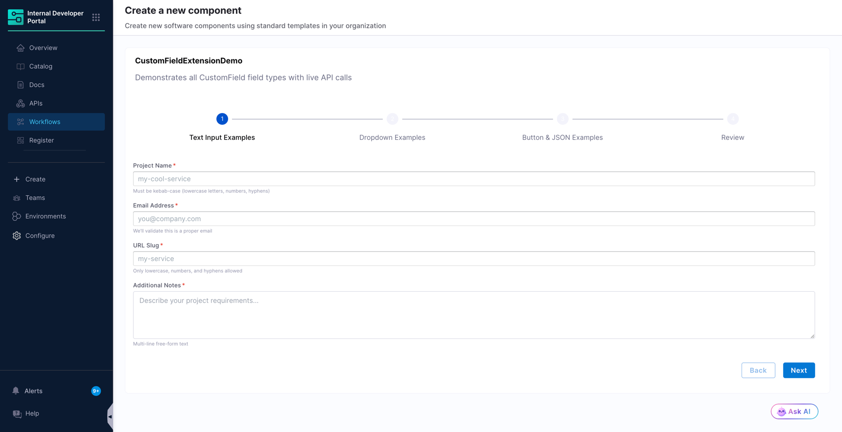
Together, these fields render as follows. The `placeholder` appears inside each input and the `description` appears beneath it.
#### Text input validated against an API
Use `apiValidation` when the value has to be checked against an external system, for example to confirm that a name is still available.
```yaml
serviceName:
type: string
title: Service Name
ui:field: CustomField
ui:options:
fieldType: text
title: Service Name
description: Checked against the service registry before submission
apiValidation:
path: proxy/dummyjson/products/1
method: GET
params:
select: title
headers:
Accept: application/json
responseValidPath: id
errorMessagePath: message
apiValidationTrigger: onClick
validateButtonText: Check availability
debounceMs: 400
```
* `responseValidPath` is the path in the API response that indicates success.
* `errorMessagePath` is the path in the API response that holds the error message to display.
* `apiValidation` accepts `method` values `GET`, `POST`, `PUT`, and `PATCH`. Use `body` to send a payload with the non-`GET` methods.
* With `apiValidationTrigger: onChange`, the call runs while the user types, throttled by `debounceMs`. With `onClick`, the field renders a button labelled by `validateButtonText` and calls the API only when that button is selected.
***
### Dropdown fields
Set `fieldType: dropdown` for single-select and multi-select pickers, backed by either a static list or an API.
| Option | Type | Description |
| ------------------ | ---------------- | --------------------------------------------------------------------------------------------------------------------------------------------------------------- |
| `options` | array | Static list of `label` and `value` pairs. |
| `apiOptions` | object | Fetches the list from an API. Accepts `path`, `method`, `params`, `headers`, `body`, `arraySelector`, `valueSelector`, `labelSelector`, and `searchQueryParam`. |
| `multiSelect` | boolean | Allows more than one value to be selected. |
| `allowCustomValue` | boolean | Allows the user to enter a value that is not in the list. |
| `dependsOn` | array of strings | Form keys the dropdown waits for before it loads its options. |
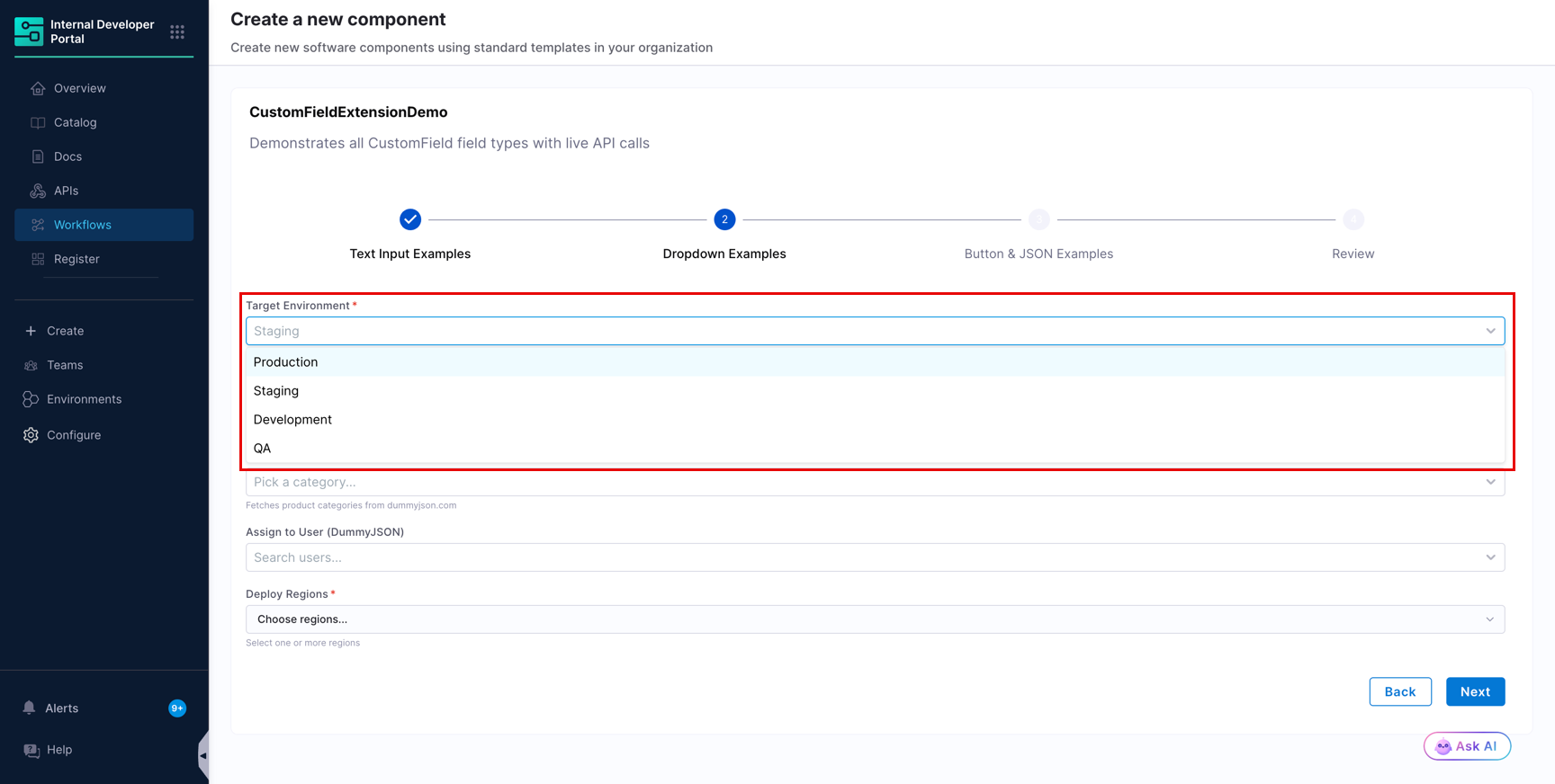
#### Static dropdown
```yaml
environment:
type: string
title: Environment
ui:field: CustomField
ui:options:
fieldType: dropdown
title: Target Environment
description: Where should this service be deployed?
placeholder: Select environment...
options:
- label: Production
value: prod
- label: Staging
value: staging
- label: Development
value: dev
- label: QA
value: qa
```
The user sees the `label` and the workflow receives the `value`.
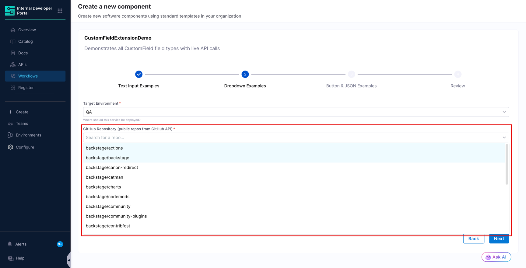
#### API-backed dropdown
```yaml
githubRepo:
type: string
title: GitHub Repo
ui:field: CustomField
ui:options:
fieldType: dropdown
title: GitHub Repository (public repos from GitHub API)
description: Fetches repos from the GitHub public API via proxy
placeholder: Search for a repo...
apiOptions:
path: proxy/github-api/orgs/backstage/repos
method: GET
params:
per_page: "20"
sort: updated
arraySelector: ""
valueSelector: full_name
labelSelector: full_name
```
* `arraySelector` points to the array inside the response. Leave it as an empty string when the response body is itself the array. Set it to a key name, such as `users`, when the array is nested under that key.
* `valueSelector` and `labelSelector` point to the keys used for the stored value and the displayed label. Set them to different keys when the identifier and the display name differ.
* `params` are appended to the request as query parameters. `headers` and `body` are sent with the request, and are useful when the endpoint is not a plain `GET`.
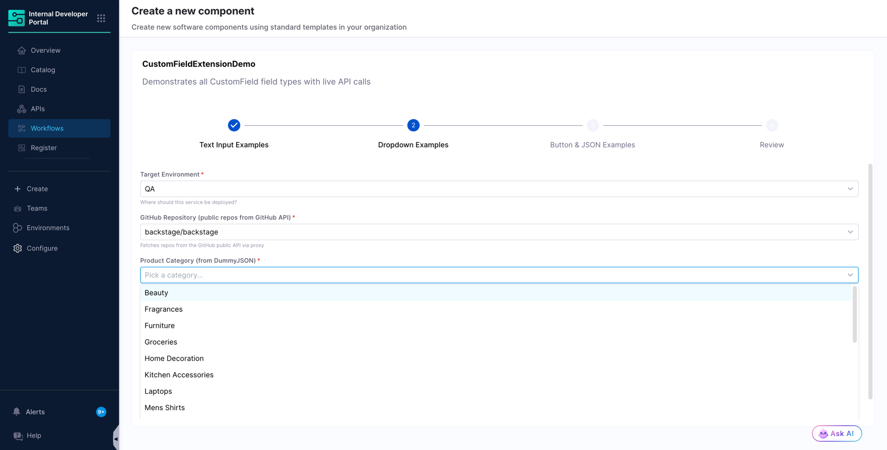
The next example fetches product categories and stores a different key for the value and the label, so the form submits the slug while the user reads the display name.
```yaml
productCategory:
type: string
title: Product Category
ui:field: CustomField
ui:options:
fieldType: dropdown
title: Product Category (from DummyJSON)
description: Fetches product categories from dummyjson.com
placeholder: Pick a category...
apiOptions:
path: proxy/dummyjson/products/categories
method: GET
valueSelector: slug
labelSelector: name
```
#### Server-side search and context data
Set `searchQueryParam` to send what the user types to the API as a query parameter, so filtering happens server side instead of in the browser. Use `setContextData` in the same block to store extra fields from the selected object.
```yaml
assignedUser:
type: string
title: Assigned User
ui:field: CustomField
ui:options:
fieldType: dropdown
title: Assign to User (DummyJSON)
description: Dynamic user list fetched from dummyjson.com with search
placeholder: Search users...
apiOptions:
path: proxy/dummyjson/users
method: GET
params:
limit: "15"
arraySelector: users
valueSelector: id
labelSelector: firstName
searchQueryParam: q
setContextData:
selectedUserEmail: email
selectedUserName: firstName
```
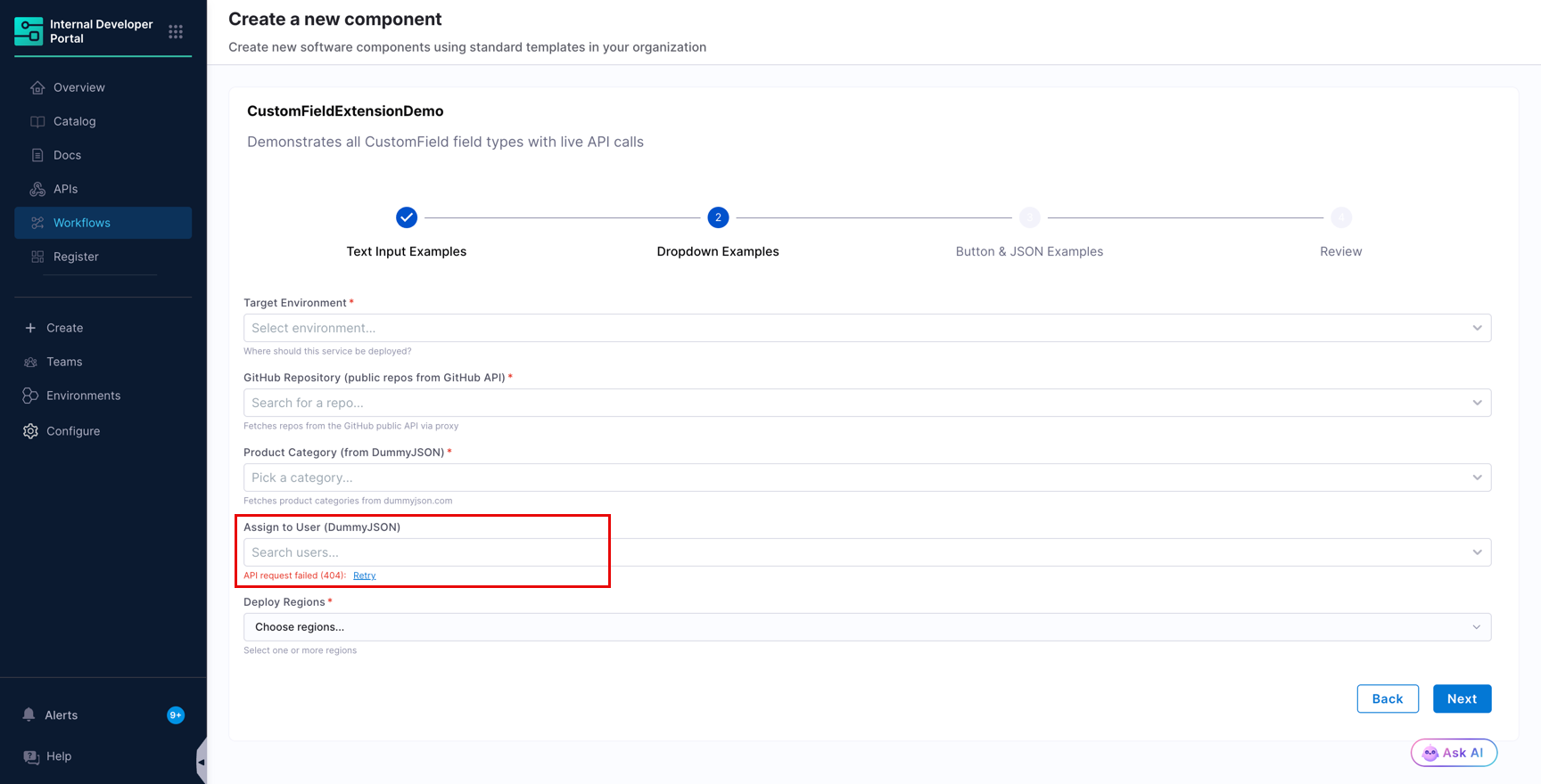
If the request fails, the field shows the failure inline along with a **Retry** link, and the rest of the form stays usable.
{% hint style="info" %}
An inline API error is most often caused by an incorrect `path`. Confirm that the path starts with `proxy/` and is not prefixed with `/api/proxy/`, that the endpoint name matches the one declared under **Configure** > **Plugins** > **Configure Backend Proxies**, and that the remaining path is valid on the target API.
{% endhint %}
#### Multi-select dropdown
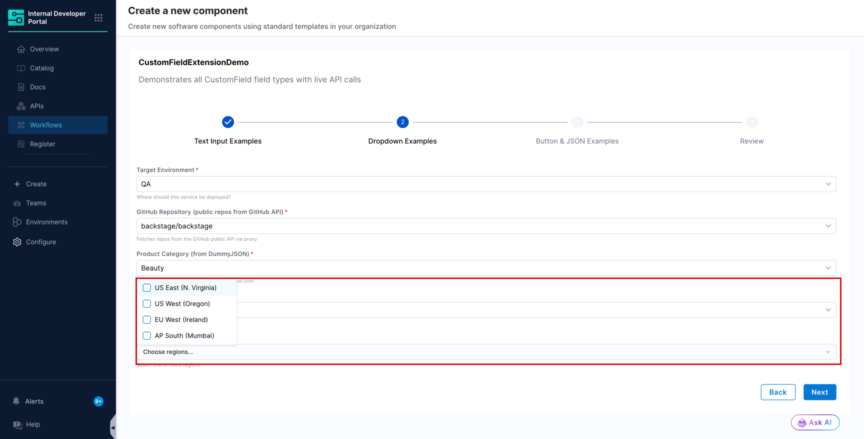
For multi-select, define the property as an array with `items`, and set `multiSelect: true`. The selected values are submitted as an array.
```yaml
multiRegion:
type: array
title: Regions
items:
type: string
ui:field: CustomField
ui:options:
fieldType: dropdown
title: Deploy Regions
description: Select one or more regions
placeholder: Choose regions...
multiSelect: true
options:
- label: US East (N. Virginia)
value: us-east-1
- label: US West (Oregon)
value: us-west-2
- label: EU West (Ireland)
value: eu-west-1
- label: AP South (Mumbai)
value: ap-south-1
```
#### Allow a value outside the list
Set `allowCustomValue: true` when the list is a set of suggestions rather than a closed set, and the user is permitted to type a value that the API or the static list does not return.
```yaml
serviceTier:
type: string
title: Service Tier
ui:field: CustomField
ui:options:
fieldType: dropdown
title: Service Tier
description: Pick a tier, or enter one that is not listed
placeholder: Select or type a tier...
allowCustomValue: true
options:
- label: Tier 1
value: tier-1
- label: Tier 2
value: tier-2
```
#### Dependent dropdowns
Use `dependsOn` to list the form keys a dropdown waits for before it loads its options. This is needed when the API path or the query parameters are built from an earlier answer, so that the request is not made with an empty value.
```yaml
organization:
type: string
title: GitHub Organization
ui:field: CustomField
ui:options:
fieldType: text
title: GitHub Organization
placeholder: backstage
repository:
type: string
title: Repository
ui:field: CustomField
ui:options:
fieldType: dropdown
title: Repository
description: Loads after you provide an organization
placeholder: Search for a repo...
dependsOn:
- organization
apiOptions:
path: proxy/github-api/orgs/{{ parameters.organization }}/repos
method: GET
arraySelector: ""
valueSelector: full_name
labelSelector: full_name
```
Reference an earlier field in the `path` with `{{ parameters. }}`, where `` is the key of the property whose value you want to substitute.
***
### Button fields
Set `fieldType: button` to run an API call from inside the form. Use it to validate a configuration, run a pre-check, or create a resource before the workflow is submitted.
| Option | Type | Description |
| ----------------- | ---------------------------------- | ------------------------------------------------------------------------------------------------------------- |
| `buttonText` | string | Label on the button. |
| `buttonVariation` | `primary`, `secondary`, `tertiary` | Visual style of the button. |
| `apiAction` | object | The call to run. Accepts `path`, `method`, `params`, `headers`, `body`, `successMessage`, and `errorMessage`. |
`apiAction.method` accepts `GET`, `POST`, `PUT`, `PATCH`, and `DELETE`.
#### Validation button
Use `setContextData` alongside `apiAction` to write values from the API response into form context, so that later fields can read them.
```yaml
validateSetup:
type: string
title: Validate
ui:field: CustomField
ui:options:
fieldType: button
title: Validate Project Setup
description: Calls DummyJSON API to simulate a validation check
buttonText: Run Validation
buttonVariation: primary
apiAction:
path: proxy/dummyjson/products/1
method: GET
successMessage: Validation passed, project setup looks good
errorMessage: Validation failed, check your inputs
setContextData:
productTitle: title
productPrice: price
```
#### Action button with a request body
Reference other inputs in the request body with `{{ parameters. }}`.
```yaml
triggerAction:
type: string
title: Create Resource
ui:field: CustomField
ui:options:
fieldType: button
title: Create a Test Resource
description: POSTs to DummyJSON to simulate creating a resource
buttonText: Create Resource
buttonVariation: secondary
apiAction:
path: proxy/dummyjson/products/add
method: POST
headers:
Content-Type: application/json
body:
title: "{{ parameters.projectName }}"
category: "{{ parameters.productCategory }}"
successMessage: Resource created successfully
errorMessage: Failed to create resource
```
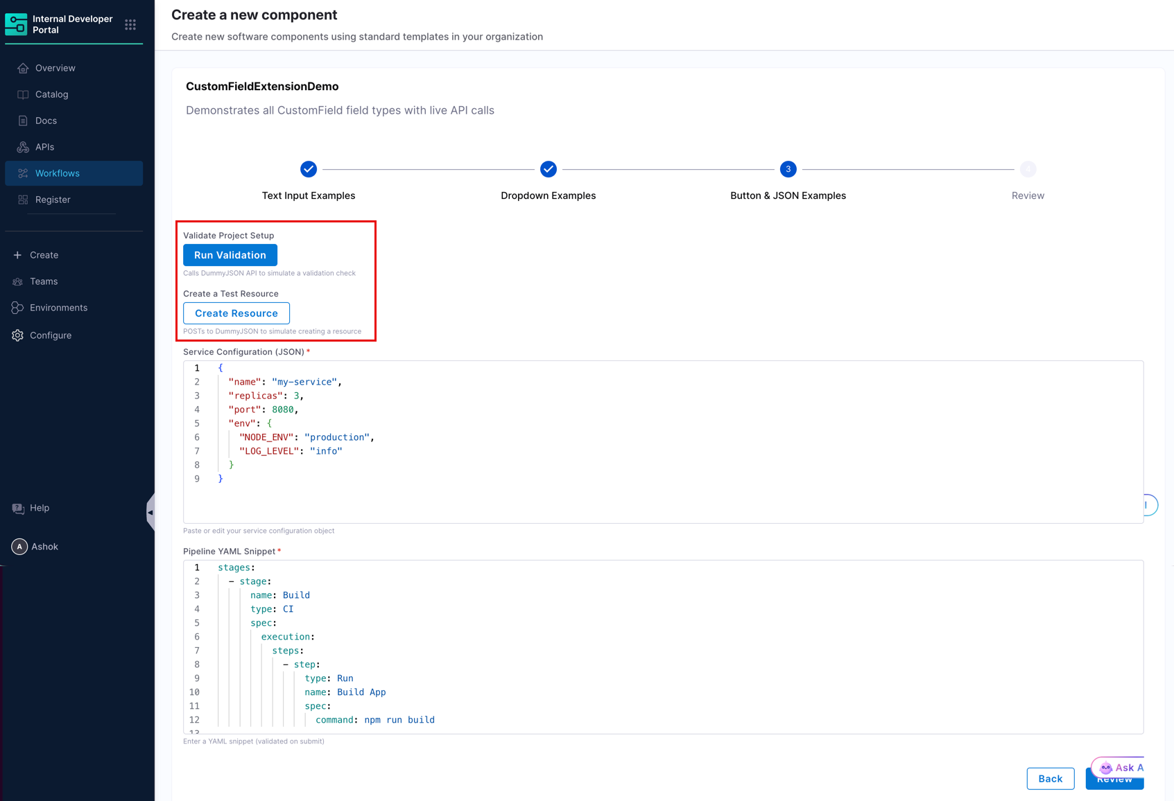
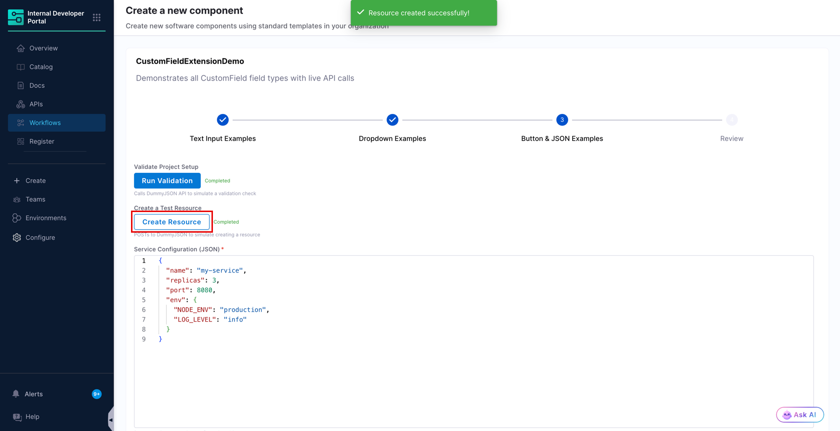
Both buttons render inline in the form, each with its own `title` above it and `description` below it.
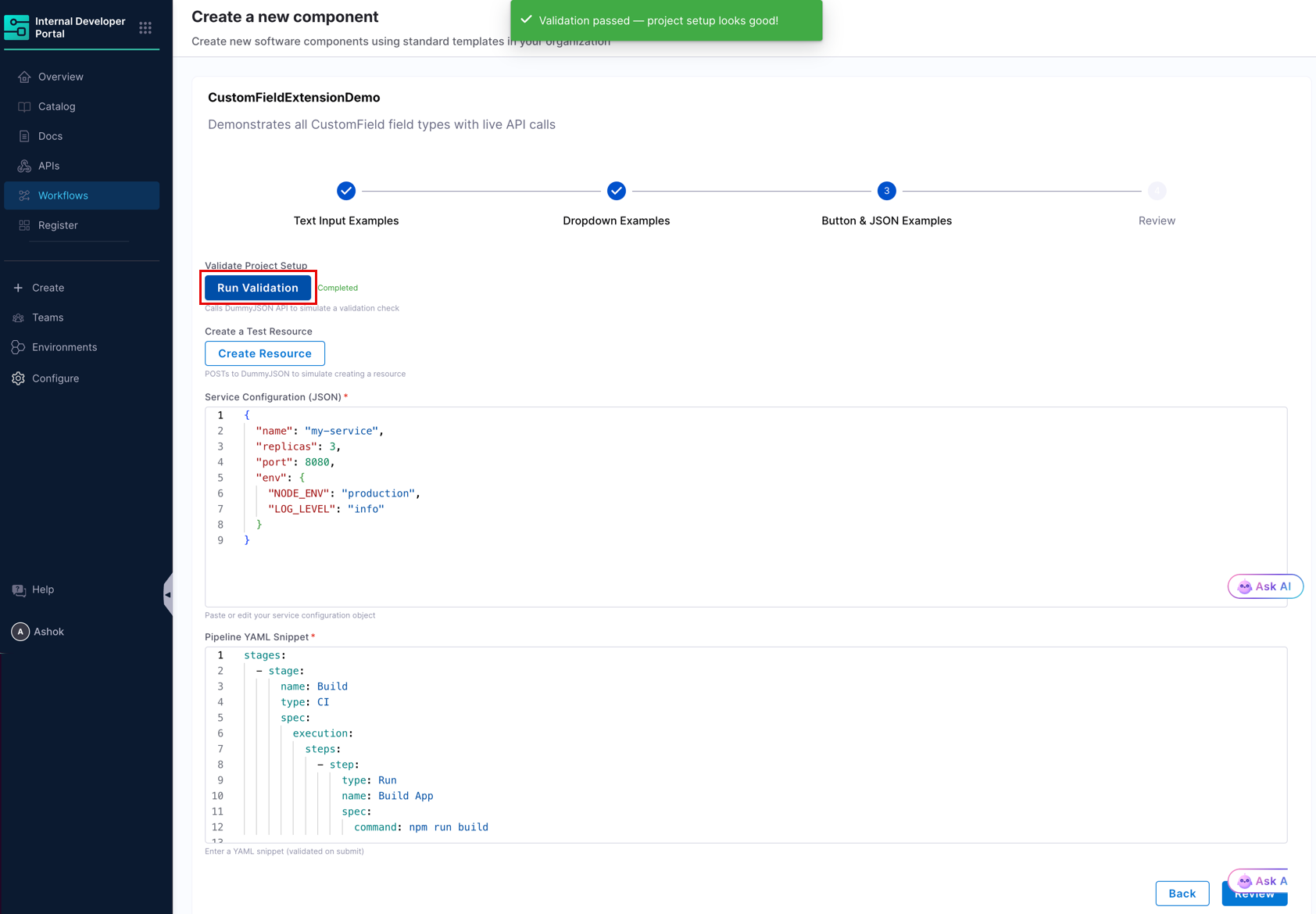
When the call succeeds, the `successMessage` appears as a toast and the button is marked **Completed**. When it fails, the `errorMessage` appears instead, and the user can run the action again.
***
### JSON and YAML editor fields
Set `fieldType: json` to embed a code editor for structured input. The editor supports both JSON and YAML through the `language` option.
| Option | Type | Description |
| -------------- | -------------- | ----------------------------------------------------------------- |
| `language` | `json`, `yaml` | Syntax highlighting and parsing mode for the editor. |
| `jsonSchema` | object | JSON Schema used to validate the content the user enters. |
| `readOnly` | boolean | Renders the editor as read-only. |
| `editorHeight` | string | Height of the editor, for example `350px`. |
| `contextKey` | string | Populates the editor from a value already stored in form context. |
Use `defaultValue` to pre-fill the editor. For JSON, supply the object directly. For YAML, supply a block scalar.
#### JSON editor with schema validation
```yaml
serviceConfig:
type: string
title: Service Configuration
ui:field: CustomField
ui:options:
fieldType: json
title: Service Configuration (JSON)
description: Paste or edit your service configuration object
language: json
editorHeight: 350px
defaultValue:
name: my-service
replicas: 3
port: 8080
env:
NODE_ENV: production
LOG_LEVEL: info
jsonSchema:
type: object
required:
- name
- port
setContextData:
parsedConfig: "name"
```
The `jsonSchema` block above requires `name` and `port` to be present in the object the user submits.
#### YAML editor
```yaml
yamlSnippet:
type: string
title: YAML Snippet
ui:field: CustomField
ui:options:
fieldType: json
title: Pipeline YAML Snippet
description: Enter a YAML snippet (validated on submit)
language: yaml
editorHeight: 250px
defaultValue: |
stages:
- stage:
name: Build
type: CI
spec:
execution:
steps:
- step:
type: Run
name: Build App
spec:
command: npm run build
```
#### Read-only editor populated from form context
Set `contextKey` to fill the editor from a value that an earlier field wrote to form context. Combine it with `readOnly: true` when the content is for review only.
```yaml
resolvedConfig:
type: string
title: Resolved Configuration
ui:field: CustomField
ui:options:
fieldType: json
title: Resolved Configuration
description: The configuration captured earlier in this form
language: json
readOnly: true
editorHeight: 250px
contextKey: parsedConfig
```
***
### Share values between fields
`CustomField` writes to the same global [form context](/internal-developer-portal/use-idp/self-service-workflows/workflows-tutorials/dynamic-picker.md#understand-form-context) used by the other workflow pickers. Add `setContextData` to a field to store values, then read them back in a later field.
```yaml
assignedUser:
type: string
ui:field: CustomField
ui:options:
fieldType: dropdown
title: Assign to User
apiOptions:
path: proxy/dummyjson/users
arraySelector: users
valueSelector: id
labelSelector: firstName
setContextData:
selectedUserEmail: email
ownerEmail:
type: string
title: Owner Email
readonly: true
ui:field: ContextViewer
ui:options:
getContextData: ${{formContext.selectedUserEmail}}
```
* The keys on the left of `setContextData` are the names you choose in form context.
* The values on the right are selectors into the API response object, or Nunjucks templates.
* Any field can read them back with `ContextViewer` and `getContextData`, and a `json` field can read them with `contextKey`.
{% hint style="info" %}
Form context is active per workflow session and is not rendered accurately in the [Workflow Playground](/internal-developer-portal/use-idp/self-service-workflows/workflowyaml.md#workflows-playground). Test context-driven fields in an actual workflow execution.
{% endhint %}
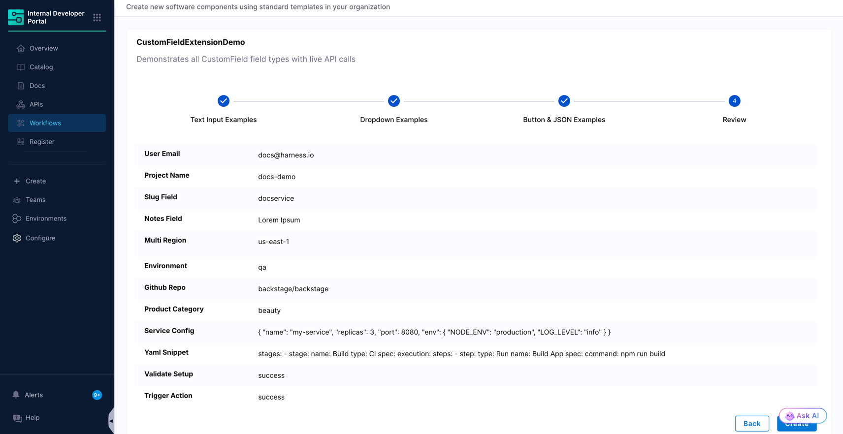
Values collected by `CustomField` inputs appear in the review step before submission, and are passed to the backend the same way as any other input.
***
### Complete example
The following workflow uses all four field types across three form pages, and logs the collected values in a backend step.
Example workflow.yaml
```yaml
apiVersion: harness.io/v1
kind: Workflow
name: CustomFieldExtensionDemo
identifier: custom_field_demo
type: service
owner: team_idp
metadata:
description: Demonstrates all CustomField field types with live API calls
spec:
parameters:
- title: Text Input Examples
required:
- projectName
- userEmail
- slugField
- notesField
properties:
projectName:
type: string
title: Project Name
ui:field: CustomField
ui:options:
fieldType: text
title: Project Name
placeholder: my-cool-service
description: Must be kebab-case (lowercase letters, numbers, hyphens)
validator: kebabCase
debounceMs: 300
userEmail:
type: string
title: User Email
ui:field: CustomField
ui:options:
fieldType: text
title: Email Address
placeholder: you@company.com
description: We validate this is a proper email
validator: email
debounceMs: 400
slugField:
type: string
title: Slug
ui:field: CustomField
ui:options:
fieldType: text
title: URL Slug
placeholder: my-service
description: Only lowercase, numbers, and hyphens allowed
regex:
pattern: ^[a-z0-9]+(?:-[a-z0-9]+)*$
message: Must be a valid URL slug (for example, my-service-123)
debounceMs: 300
notesField:
type: string
title: Notes
ui:field: CustomField
ui:options:
fieldType: text
title: Additional Notes
placeholder: Describe your project requirements...
description: Multi-line free-form text
multiline: true
- title: Dropdown Examples
required:
- environment
- githubRepo
- productCategory
- multiRegion
properties:
environment:
type: string
title: Environment
ui:field: CustomField
ui:options:
fieldType: dropdown
title: Target Environment
description: Where should this service be deployed?
placeholder: Select environment...
options:
- label: Production
value: prod
- label: Staging
value: staging
- label: Development
value: dev
- label: QA
value: qa
githubRepo:
type: string
title: GitHub Repo
ui:field: CustomField
ui:options:
fieldType: dropdown
title: GitHub Repository (public repos from GitHub API)
description: Fetches repos from the GitHub public API via proxy
placeholder: Search for a repo...
apiOptions:
path: proxy/github-api/orgs/backstage/repos
method: GET
params:
per_page: "20"
sort: updated
arraySelector: ""
valueSelector: full_name
labelSelector: full_name
productCategory:
type: string
title: Product Category
ui:field: CustomField
ui:options:
fieldType: dropdown
title: Product Category (from DummyJSON)
description: Fetches product categories from dummyjson.com
placeholder: Pick a category...
apiOptions:
path: proxy/dummyjson/products/categories
method: GET
valueSelector: slug
labelSelector: name
assignedUser:
type: string
title: Assigned User
ui:field: CustomField
ui:options:
fieldType: dropdown
title: Assign to User (DummyJSON)
description: Dynamic user list fetched from dummyjson.com with search
placeholder: Search users...
apiOptions:
path: proxy/dummyjson/users
method: GET
params:
limit: "15"
arraySelector: users
valueSelector: id
labelSelector: firstName
searchQueryParam: q
setContextData:
selectedUserEmail: email
selectedUserName: firstName
multiRegion:
type: array
title: Regions
items:
type: string
ui:field: CustomField
ui:options:
fieldType: dropdown
title: Deploy Regions
description: Select one or more regions
placeholder: Choose regions...
multiSelect: true
options:
- label: US East (N. Virginia)
value: us-east-1
- label: US West (Oregon)
value: us-west-2
- label: EU West (Ireland)
value: eu-west-1
- label: AP South (Mumbai)
value: ap-south-1
- title: Button and JSON Examples
required:
- validateSetup
- triggerAction
- serviceConfig
- yamlSnippet
properties:
validateSetup:
type: string
title: Validate
ui:field: CustomField
ui:options:
fieldType: button
title: Validate Project Setup
description: Calls DummyJSON API to simulate a validation check
buttonText: Run Validation
buttonVariation: primary
apiAction:
path: proxy/dummyjson/products/1
method: GET
successMessage: Validation passed, project setup looks good
errorMessage: Validation failed, check your inputs
setContextData:
productTitle: title
productPrice: price
triggerAction:
type: string
title: Create Resource
ui:field: CustomField
ui:options:
fieldType: button
title: Create a Test Resource
description: POSTs to DummyJSON to simulate creating a resource
buttonText: Create Resource
buttonVariation: secondary
apiAction:
path: proxy/dummyjson/products/add
method: POST
body:
title: "{{ parameters.projectName }}"
category: "{{ parameters.productCategory }}"
successMessage: Resource created successfully
errorMessage: Failed to create resource
serviceConfig:
type: string
title: Service Configuration
ui:field: CustomField
ui:options:
fieldType: json
title: Service Configuration (JSON)
description: Paste or edit your service configuration object
language: json
editorHeight: 350px
defaultValue:
name: my-service
replicas: 3
port: 8080
env:
NODE_ENV: production
LOG_LEVEL: info
jsonSchema:
type: object
required:
- name
- port
setContextData:
parsedConfig: "name"
yamlSnippet:
type: string
title: YAML Snippet
ui:field: CustomField
ui:options:
fieldType: json
title: Pipeline YAML Snippet
description: Enter a YAML snippet (validated on submit)
language: yaml
editorHeight: 250px
defaultValue: |
stages:
- stage:
name: Build
type: CI
spec:
execution:
steps:
- step:
type: Run
name: Build App
spec:
command: npm run build
steps:
- id: log
name: Log Parameters
action: debug:log
input:
message: |-
Project: ${{ parameters.projectName }}
Email: ${{ parameters.userEmail }}
Env: ${{ parameters.environment }}
Repo: ${{ parameters.githubRepo }}
Category: ${{ parameters.productCategory }}
Config: ${{ parameters.serviceConfig }}
```
***
### Migrate from SelectFieldFromApi and ValidateAndFetch
Existing workflows continue to work. When you move a field to `CustomField`, map the options as follows.
| Existing configuration | CustomField equivalent |
| ----------------------------------------------- | ------------------------------------------------------------------------------------------------- |
| `ui:field: SelectFieldFromApi` | `ui:field: CustomField` with `fieldType: dropdown` |
| `path` on the picker | `apiOptions.path` |
| `valueSelector` | `apiOptions.valueSelector`, plus `apiOptions.labelSelector` when the label differs from the value |
| `request` on the picker | `apiOptions.method`, `apiOptions.headers`, and `apiOptions.body` |
| `ui:field: ValidateAndFetch` | `ui:field: CustomField` with `fieldType: button` |
| `button.title` | `buttonText` |
| `path` and `request` on the button | `apiAction.path`, `apiAction.method`, `apiAction.headers`, and `apiAction.body` |
| `setContextData` | `setContextData`, unchanged |
| `ui:field: ContextViewer` for read-only display | Unchanged, or a `json` field with `contextKey` and `readOnly: true` for structured values |
***
### Frequently asked questions Do I have to replace my existing SelectFieldFromApi and ValidateAndFetch fields?
No. Workflows that use those components continue to work. Use CustomField for new fields, and migrate existing ones when you are already editing that part of the workflow.
Can I use more than one CustomField in the same workflow?
Yes. You can use as many CustomField properties as you need, across as many form pages as you need, and each one can use a different fieldType. The complete example on this page uses all four field types across three pages.
Which options are required?
Only `fieldType`. Every other option under `ui:options` is optional, and the set that applies depends on the `fieldType` you choose. Options that belong to a different field type are ignored.
Why does my dropdown show no options even though the API returns data?
Check `arraySelector` first. It has to point at the array inside the response body. If the response body is itself the array, set it to an empty string. If the array is nested, set it to the key that holds it, such as `users`. Then confirm that `valueSelector` and `labelSelector` match keys that exist on each object in that array.
Why does my API-backed field show an error and a Retry link?
The request through the backend proxy did not succeed. Confirm that the path is in the format `proxy//` and is not prefixed with `/api/proxy/`, that the endpoint name matches the one declared under Configure > Plugins > Configure Backend Proxies, and that any secret referenced in the proxy headers exists. Selecting Retry repeats the request without resetting the rest of the form.
What is the difference between validator, regex, and apiValidation on a text field?
`validator` applies a built-in named check such as `kebabCase` or `email`. `regex` applies a pattern you supply, with your own error message, and is the option to use when no named validator fits. Both run in the browser. `apiValidation` calls an external service, and is the right choice when the answer depends on state that only that service knows, such as whether a name is already taken.
Can I stop API validation from firing on every keystroke?
Yes. Set `apiValidationTrigger: onClick` so validation runs only when the user selects the validate button, and set `validateButtonText` to label that button. If you keep `onChange`, raise `debounceMs` to reduce the number of calls.
Does a button field block submission until it succeeds?
A button field runs its API call when selected and reports success or failure inline, and the button is marked Completed after a successful call. List the property under `required` for that form step if the workflow should not proceed without it.
Can the JSON field hold YAML?
Yes. Set `language: yaml` on a field with `fieldType: json`. The editor then highlights and parses YAML. Use `editorHeight` to size the editor to the expected content, and `defaultValue` with a block scalar to pre-fill it.
How do I make a field read-only?
For a `json` field, set `readOnly: true` under `ui:options`. For other field types, use the standard workflow property `ui:readonly: true` as described in [Add read only fields](/internal-developer-portal/use-idp/self-service-workflows/create-workflow/flows-input.md#add-read-only-fields).
How do I pass a CustomField value into a Harness pipeline?
The same way as any other input. Reference it with `${{ parameters. }}` in the `inputset` of your `trigger:harness-custom-pipeline` step. See [Setting up the backend with IDP pipeline](/internal-developer-portal/use-idp/self-service-workflows/create-workflow/harness-pipeline.md).
Can I preview CustomField behavior in the Workflow Playground?
Only partially. The playground does not render form context or live API responses accurately. Test API-backed dropdowns, buttons, and context-driven fields in an actual workflow execution.
{% @harness-feedback/feedback %}