> For the complete documentation index, see [llms.txt](https://developer.harness.io/llms.txt). Markdown versions of documentation pages are available by appending `.md` to page URLs; this page is available as [Markdown](https://developer.harness.io/resilience-testing/load-testing/analyze-results/javascript-analyze-results.md).
# JavaScript
{% @harness-package-selector/package-selector platforms="%5B%7B%22label%22%3A%22Python%22%2C%22slug%22%3A%22python%22%2C%22path%22%3A%22resilience-testing%2Fload-testing%2Fanalyze-results%2Fpython-analyze-results%22%7D%2C%7B%22label%22%3A%22JavaScript%22%2C%22slug%22%3A%22javascript%22%2C%22path%22%3A%22resilience-testing%2Fload-testing%2Fanalyze-results%2Fjavascript-analyze-results%22%7D%2C%7B%22label%22%3A%22Java%22%2C%22slug%22%3A%22java%22%2C%22path%22%3A%22resilience-testing%2Fload-testing%2Fanalyze-results%2Fjava-analyze-results%22%7D%5D" selectedPlatform="javascript" %}
### Run overview
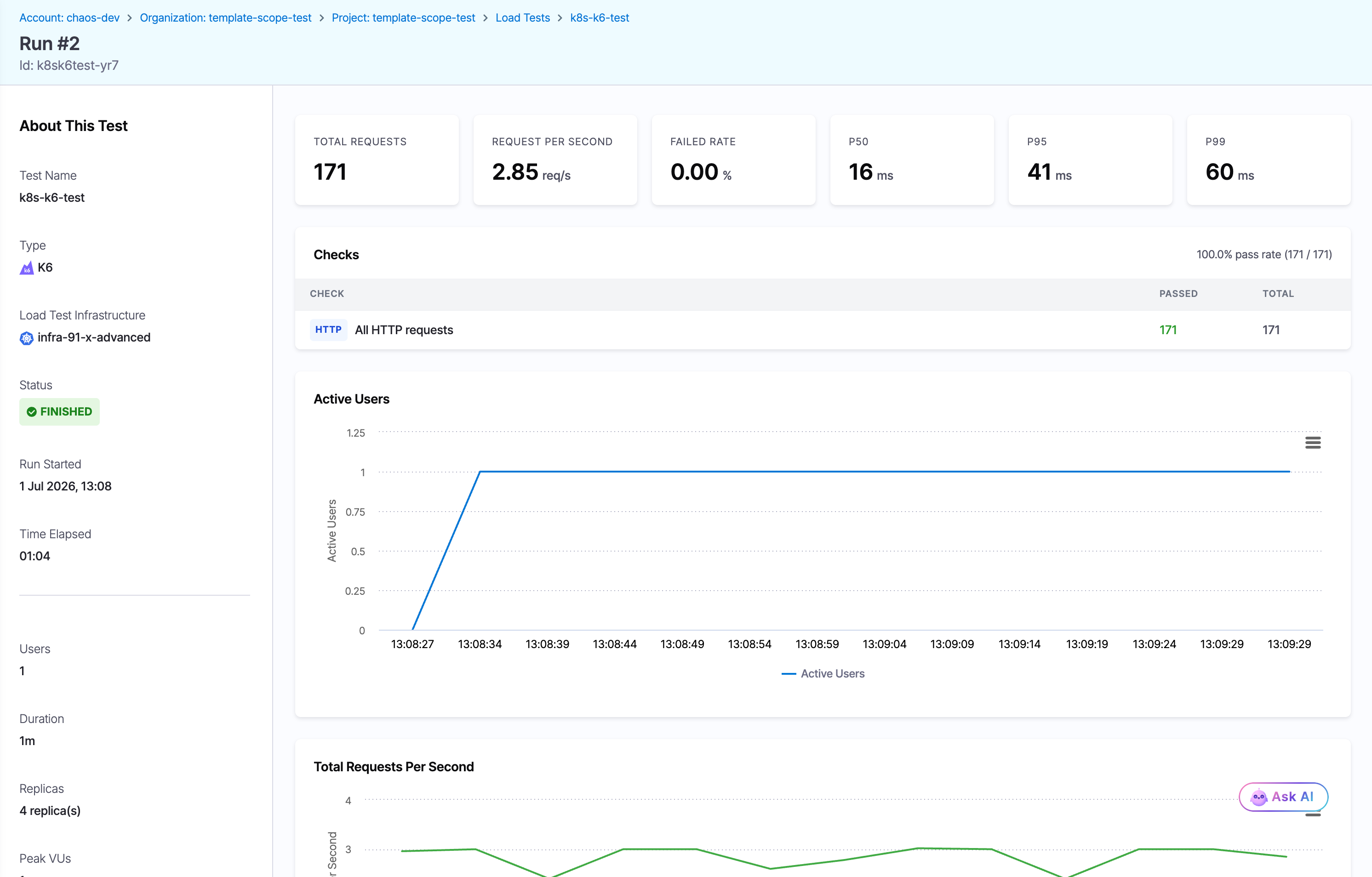
The left panel, titled **About This Test**, shows the test metadata and the live status of the execution.
| Field | Description |
| ---------------------------- | -------------------------------------------------------------------------- |
| **Test Name** | Name of the load test. |
| **Load Test Infrastructure** | The infrastructure that ran the test, with its connection status. |
| **Type** | Reads **JavaScript**. |
| **Users** | Peak concurrent virtual users configured. |
| **Duration** | Total configured test duration. |
| **Replicas** | Number of runner pods the load was split across for distributed execution. |
| **Peak VUs** | Highest number of virtual users reached during the run. |
| **Run Started** | Timestamp when the execution began. |
| **Time Elapsed** | How long the test has run, or the total runtime once complete. |
| **Status** | Execution status: **Running**, **Finished**, or **Failed**. |
Click to view full size
*The Run detail page for a finished k6 run. The k6 cards report Failed Rate and the P50, P95, and P99 percentiles, and the Checks table shows a 100% pass rate. This run defined no thresholds, so no Thresholds table appears.*
### Summary cards
The cards across the top of the results panel report the headline metrics for a k6 run:
| Metric | What it measures |
| ---------------------- | ------------------------------------------------------------------------------ |
| **Total Requests** | Total number of requests sent during the test. |
| **Request Per Second** | Average throughput across the whole run, in requests per second. |
| **Failed Rate** | Percentage of requests that failed. |
| **P50** | Median response time, in milliseconds. |
| **P95** | 95th-percentile response time. Five percent of requests were slower than this. |
| **P99** | 99th-percentile response time, useful for spotting tail latency. |
### Thresholds and checks
Below the summary cards, k6 runs show up to two extra tables.
* **Thresholds:** This table appears only when the test defines thresholds. Each row shows a **Metric**, its pass/fail **Condition** (for example, `p(95)<5000`), the **Actual** measured value, and a **Status**. A breached threshold marks the whole run as **Failed**, which is how a k6 test becomes a release gate. The status reads `PENDING` while the run is in progress. A test with no thresholds shows no Thresholds table.
* **Checks:** Validations declared in the script or built in the UI. The table lists each **Check** with its **Passed** and **Total** counts and an overall pass rate (for example, `100.0% pass rate (171 / 171)`). Failed checks are recorded but do not fail the run on their own.
Go to [k6](/resilience-testing/load-testing/create-a-load-test/k6.md#gate-a-release-with-passfail-thresholds) to configure thresholds and checks.
### Charts
The charts visualize how the test behaved over time.
#### Active users
A time-series line chart of concurrent virtual users. Use it to confirm the load followed the shape you configured:
* The **ramp-up phase**, where users rise linearly from zero to the configured peak.
* The **steady-state phase**, where the count plateaus at the peak.
* The **ramp-down** at the end, or an early drop if the run stopped or failed.
#### Total requests per second
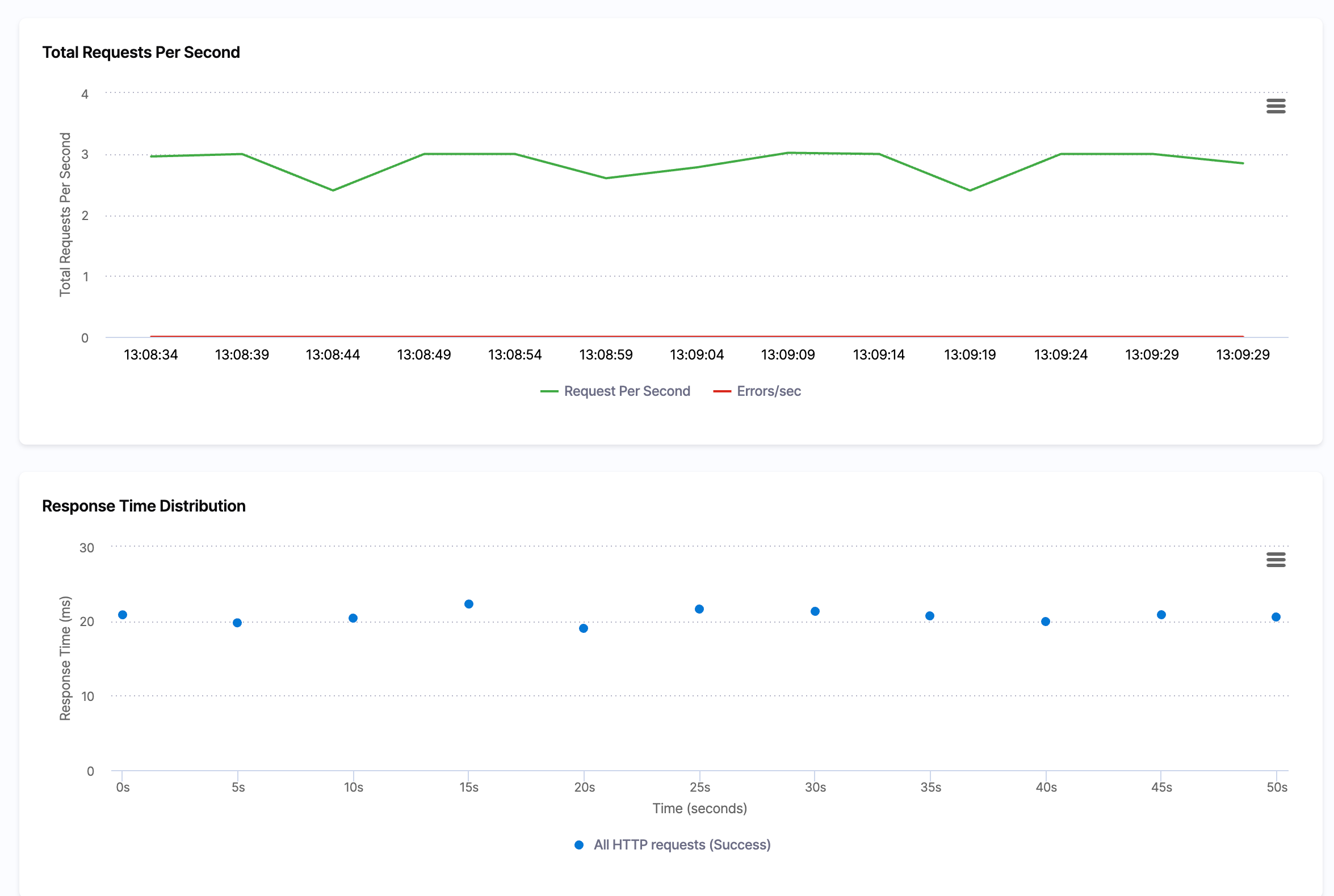
A time-series chart with two lines:
* **Request Per Second** (green): throughput over time.
* **Errors/sec** (red): errors over time.
Read the two lines together to see whether throughput holds under sustained load and whether errors climb as users increase. A rising red line while the green line flattens is a strong sign the system is at capacity.
#### Response time distribution
A scatter plot of individual request response times over the run. Each point is color-coded by request name and outcome:
* **Success:** requests that returned a successful response and passed all assertions.
* **Failure:** requests that failed or violated an assertion.
Use it to spot latency that drifts upward as load increases, outlier requests, and whether response times stay within your target.
#### Response time histogram
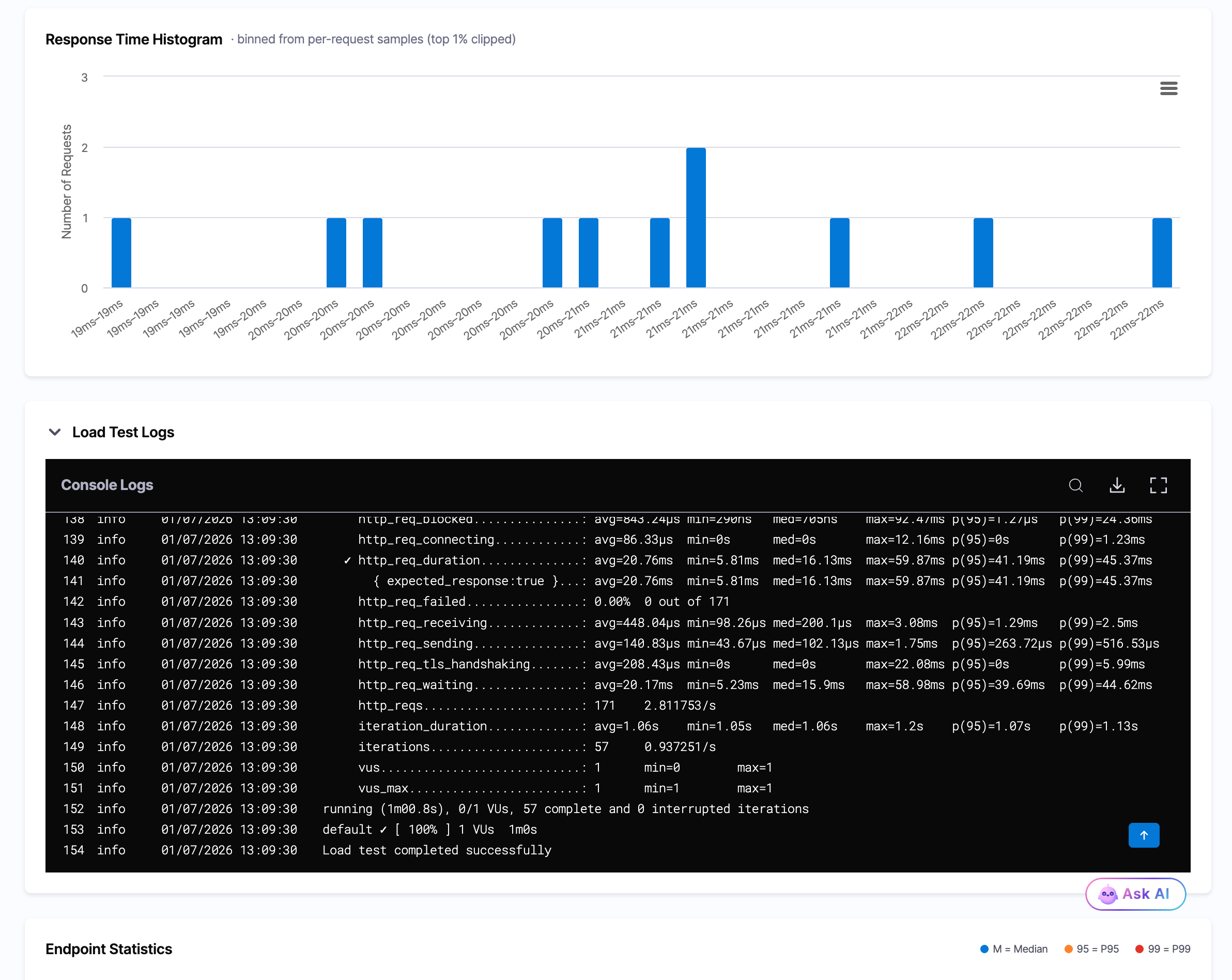
A histogram that bins the per-request response times and plots how many requests fell into each latency band. The subtitle notes that the top one percent of samples is clipped so a few slow outliers do not distort the scale. Use it to see the typical latency band and how tightly response times cluster.
Click to view full size
*A k6 run. Alongside the Total Requests Per Second and Response Time Distribution charts, k6 adds a Response Time Histogram that groups requests into latency bands.*
### Console logs and endpoint statistics
Below the charts, two sections give you the raw detail behind the summary.
* **Load Test Logs:** An expandable **Console Logs** panel with the streamed k6 output. You can search, download, or open it full screen. It lists the built-in k6 metrics, such as `http_req_duration` with its avg, min, med, max, `p(95)`, and `p(99)` values, `http_req_failed`, `http_reqs`, `iteration_duration`, and `vus`.
* **Endpoint Statistics:** A per-endpoint breakdown. Each row shows the **Endpoint**, **Requests**, **Fails**, a **Latency (ms)** bar marking the median (M), 95th (95), and 99th (99) percentiles, the **Avg (ms)**, and the **Current RPS**. An **Aggregated** row totals every endpoint.
Click to view full size
*The k6 Response Time Histogram above the Console Logs panel, which lists the built-in k6 metrics, and the Endpoint Statistics table below.*
{% @harness-feedback/feedback %}