> For the complete documentation index, see [llms.txt](https://developer.harness.io/llms.txt). Markdown versions of documentation pages are available by appending `.md` to page URLs; this page is available as [Markdown](https://developer.harness.io/service-reliability-management/use-srm/change-impact-analysis/change-impact-analysis-service-health-dashboard.md).
# Change Impact dashboard
Observe and track the impact of changes on the health of a monitored service.
The Change Impact dashboard enables you to observe and track the health of monitored services.
The Change Impact dashboard helps you:
* Track the overall health of your services, spot anomalies, and take timely action.
* Track change events that impact your monitored service.
* Observe and analyze dependencies between applications, infrastructure, and data.
* View metrics to analyze patterns, historic trends, performance changes, and correlate the data over a period.
* View log data required for debugging issues.
To view the Change Impact dashboard:
1. In your Harness project, navigate to the **Service Reliability Management** module, and then select **Monitored Services**.\
A list of all monitored services appears.
2. Select the monitored service for which you want to see the health data.
3. Select the **Change Impact** tab.\
The Change Impact dashboard appears.
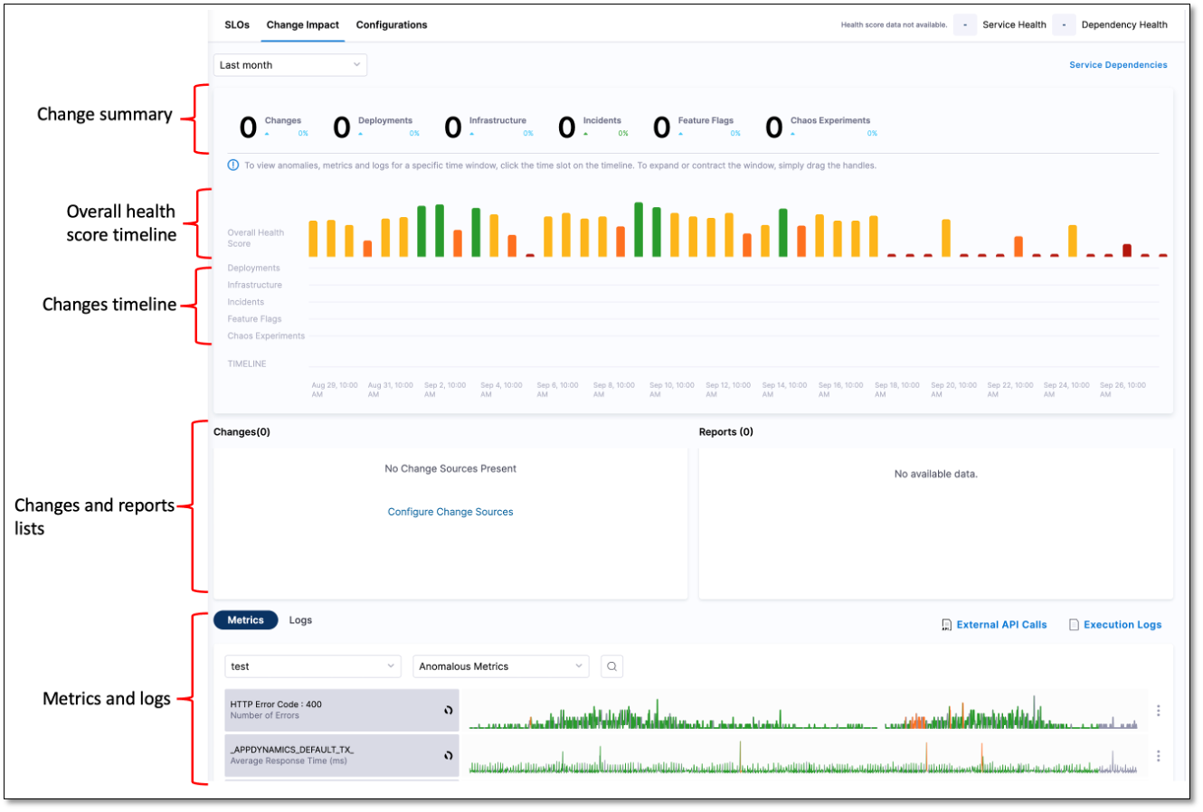
The **Change Impact** tab is divided into the following sections:
* Change summary
* Overall health score timeline
* Changes list
* Reports list
* Metrics and logs
#### Change summary
The change summary displays the number of changes in deployments, infrastructure, and incidents for a specific time period. You can specify the time period for which you want to see the data. The available options are:
* Last 24 hours (default setting)
* Last 4 hours
* Last 3 days
* Last 7 days
* Last month
#### Overall Health Score timeline
The overall health score timeline is a graphical overview of the health of a service over a specified time period. The graph is divided into time slots of equal length. The span of each division depends on the time period setting. The graph displays changes in deployments, infrastructures, feature flags, and chaos experiments. It also displays incidents. The graph helps you correlate data over a time period and analyze the impact of change on the reliability of the service.
Health scores range from 0 to 100. The total health score calculation is based on the following:
* Incidents
* Events associated with deployments
* Events associated with infrastructure changes
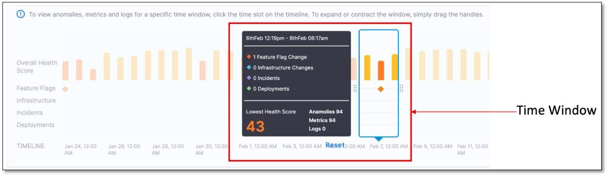
The Overall Health Score timeline has a time window that displays granular details such as health score, incident count, metrics, and logs for a specific time period on the graph. You can move the time window along the graph to choose a specific time period. You can change the time period by using the handles.
#### Changes list
The **Changes** list provides a detailed breakdown of all the changes that occurred in deployment, infrastructure, feature flags, and chaos experiments during the selected time period. It also displays the incidents from the incident management tool during the selected time period. You can see the following information in the **Changes** list:
* Deployments such as ECS, Kubernetes, and Helm from the Harness Deployment module.
* Infrastructure changes such as Kubernetes events, Terraform audit logs, MongoDB audit events, AWS CloudTrail, GCP audit logs, and Azure audit logs.
* Incidents from incident management tool such as PagerDuty.
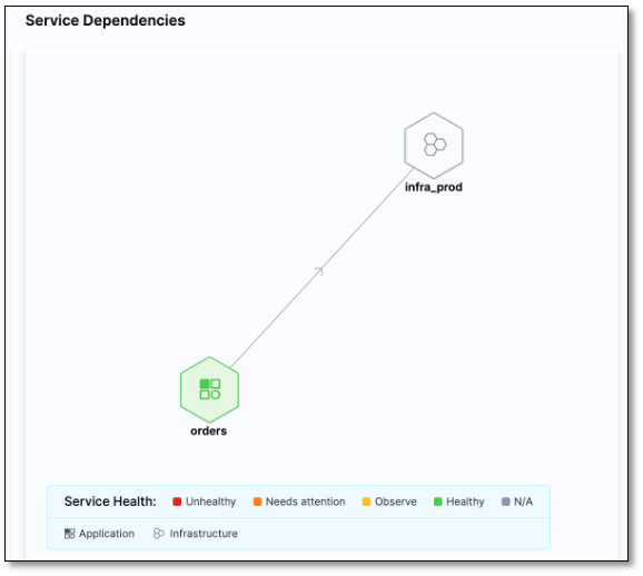
#### Service dependencies
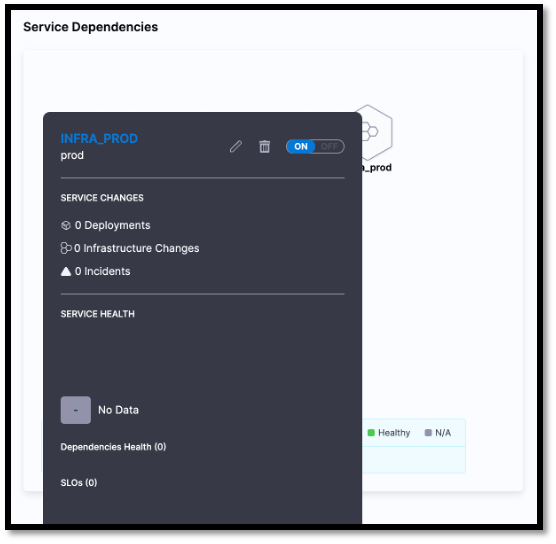
The **Service Dependency** section graphically displays the dependencies between applications, infrastructure, and data.
You can get a quick overview of the service health by selecting a service.
#### Metrics and logs
The **Metrics** and **Logs** tabs display the metrics and log data collected at regular intervals.
**Metrics tab**
The **Metrics** tab displays the metrics collected at regular intervals.
You can customize the metrics list using the following filters:
* **All Metrics**: Displays all the metrics captured by the health sources.
* **Anomalous Metrics**: Displays the anomalous metrics captured by the health sources.
{% hint style="info" %}
**NOTE**
If you've set up Prometheus as the health source, clicking on a metric entry on the Service Health page takes you directly to the Prometheus metrics dashboard.
{% endhint %}
**Logs tab**
You can drill down log data using the following filters:
* **Known**
* **Unknown**
* **Unexpected Frequency**
{% @harness-feedback/feedback %}