Additional Info Card in Overview Page
Introduction
Now you can add an Additional Info Card to the overview page and populate it with the catalog-info.yaml metadata for all the root fields apiVersion, kind, metadata, and spec along with the supported values under the root field. e.g., <+spec.type>
Usage
This card can help you display additional information like name of team lead, list of the tools used for your software component etc., in your catalog overview page of a particular software component. This also enables you to display the additionally ingested items in the catalog using catalog metadata ingestion API.
Layout
This card component needs to be added in Layout under Admin section. Here's an example
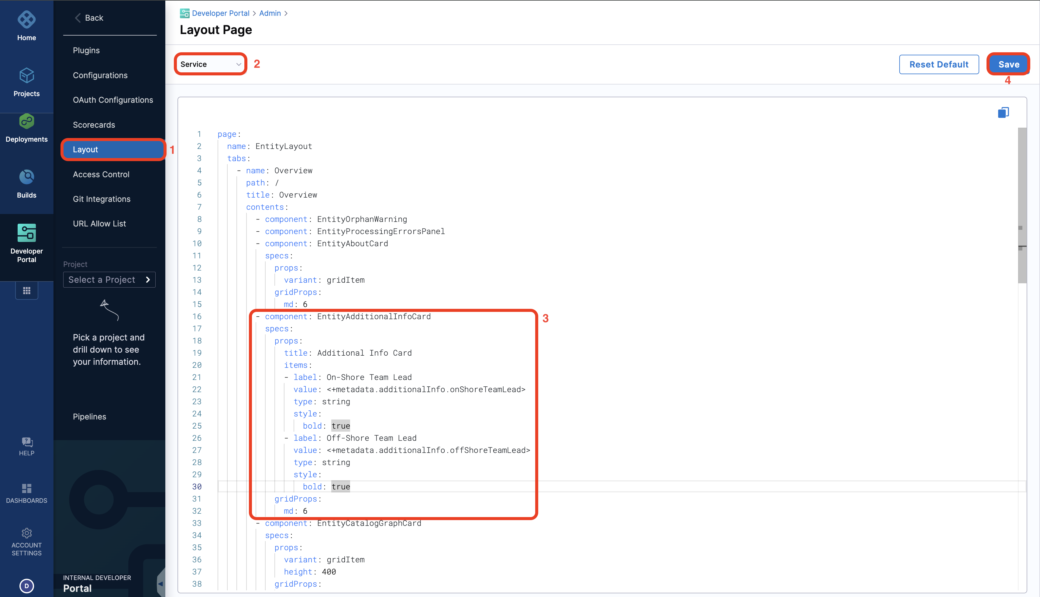
- component: EntityAdditionalInfoCard
specs:
props:
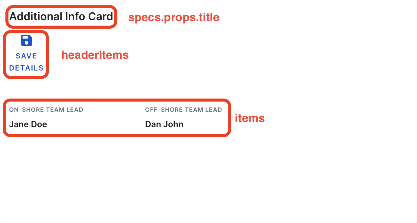
title: Additional Info Card
headerItems:
- icon: SaveRounded
label: Save Details
url: https://www.aftifactregistry.com
items:
- label: On-Shore Team Lead
value: <+metadata.additionalInfo.onShoreTeamLead>
type: string
style:
bold: true
- label: Off-Shore Team Lead
value: <+metadata.additionalInfo.offShoreTeamLead>
type: string
style:
bold: true
gridProps:
md: 6
All the fields mentioned here supports the root fields data to be sourced from catalog-info.yaml as strings.
items:
Contains the information sourced from catalog-info.yaml
label:Astringto provide information regarding the value displayed.value:The value you want to display against the added label, usually fromcatalog-info.yamltype:Default value is string also supportslinktype.style:This is used for text styling as mentioned in the example above.
headerItems (Optional):
Add all the information to be displayed in the header of the card
icon:All material icon supported.url:You can add alinkto the material icon using this.label:Astringto provide information regarding the icon.
Advanced Usage
You can as well add a Header Item with an icon and a hyperlink, even the title can be sourced from catalog.
## Example Layout
...
- component: EntityAdditionalInfoCard
  specs:
    props:
      title: <+kind>
      headerItems:
      - icon: SaveRounded
        label: Save Details
        url: https://www.<+metadata.additionalInfo.artifactRegistry>.com
      items:
      - label: On-Shore Team Lead
        value: <+metadata.additionalInfo.onShoreTeamLead>
        type: string
        style:
          bold: true
          italic: true
      - label: Off-Shore Team Lead
        value: <+metadata.additionalInfo.offShoreTeamLead>
        type: string
        style:
          bold: true
      - label: <+metadata.additionalInfo.orgStructureName>
        value: <+metadata.additionalInfo.businessUnitName>
        style:
          bold: true
    gridProps:
      md: 6
...
Additional Info
To add any other information other than what's available in the root fields we have support for additionalInfo under metadata.
Here's an example:
apiVersion: backstage.io/v1alpha1
kind: Component
metadata:
  name: "demo-catalog-datasource"
  additionalInfo:
    onShoreTeamLead: Jane Doe
    offShoreTeamLead: Dan John
  annotations:
    backstage.io/techdocs-ref: dir:.
spec:
  type: service
  owner: "IDPAdmin"
  lifecycle: experimental
In the above example, we have added key value pairs under additionalInfo, and it's only possible to display the values using the key. For example, you can add <+metadata.name.additionalInfo.onShoreTeamLead> in the layout to get the name Jane Doe displayed in the Additional Info Card.